**Preview only**
Be sure to submit your comment
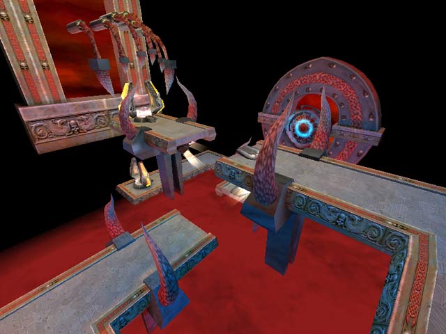
This map is an interesting mix of different dimensions. A lot of neat ideas that don't necessarily fit together, but is cool nonetheless. Fun to play with the Nihilism and Hunt mods. 3.5/5
Edited 1462.77 days after the original posting.
Agree (0) or Disagree (0)
For a second i thought looking at the screen "Pokeball Odysseys?" xD
Agree (0) or Disagree (0)
megatechno
unregistered
#27 10 Jul 2004
nice map d00d
Agree (0) or Disagree (0)
Tombot
unregistered
#26 06 Mar 2004
Sorry I meant map, duuh
Agree (0) or Disagree (0)
Tombot
unregistered
#25 06 Mar 2004
I cannot comment on this movie because the download time is 80 minutes on the free public servers
Agree (0) or Disagree (0)
{TH}*ScOrPiUs
unregistered
#24 31 Oct 2001
The game play was above average. I love the unique design of the map. I wish more map makers out there would take note and break away from the standard. A very refreshing change it will stay on my computer for a long while. My only complaint is that for some reason it did not show up in the squirmish menu. Keep up the good work.
Agree (0) or Disagree (0)
DBD
unregistered
#23 14 May 2000
Afterall, it takes me time, but I changed my mind, I found the gameplay of this map very fun. I think that there's an error, the joined arena file that set the default bots includes too many bots. Before I didn't realize that and put the map in the box of those too tough or too technical for me. But now I played it with less bots in FFA, three bots, and had a lot of fun. For mention, Major, Gorre and Sorlag for a not too tough play. This completly changed the gameplay. As there are less bots, you find places where to sneak and hide, you'll have some small time to take your breeze which is important in a thecnical map which is also very technical, you'll have chance to escape. And now, I had a lot of fun to ambush, hide, snipe, jump, flee, and so on. Now I don't want to change a single bit of the map except perhaps the moving platform that lead to the quaddamage that I'll made more plain as it's already a very exposed and dangerous place. Bots play it well but I also not few minor flaws in bot play so now I gave it a 9.5 but as it's not possible I gave it a 9. Thanks youri!
Agree (0) or Disagree (0)
Rave
unregistered
#22 03 May 2000
Feelin a little twitched?
Agree (0) or Disagree (0)
elTwitcho
unregistered
#21 01 May 2000
Ooops, I'm a fool, there goes the validity of my statements. Had to make a spelling correction so I stopped it changed it and posted again, sorry about that
Agree (0) or Disagree (0)
elTwitcho
unregistered
#20 01 May 2000
Loved the map, excelent job Yuri, as for unreal tournament... hehe. Very well done, one of the more original maps I've seen in a very long time, only thing I could ask is for a little bit more room to move around and possibly to make the level slightly bigger, but all in all, a very cool map
Agree (0) or Disagree (0)
elTwitcho
unregistered
#19 01 May 2000
Loved the map, excelent job Yuri, as for unreal tournament... hehe. Very well done, one of the more original maps I've seen in a very lon time, only thing I could ask is for a little bit more room to move around and possibly to make the level slightly bigger, but all in all, a very cool map
Agree (0) or Disagree (0)
RaVe
unregistered
#18 01 May 2000
Hey
If this is made by the author who has also made the terrific quake2 series space oddysey 1-2-3 then I'm a bit dissapointed.
:)
But if yuri is still learning the quake arena engine, i'm not that disappointed ;) okay dude?
Agree (0) or Disagree (0)
not entered
unregistered
#17 30 Apr 2000
I found your HOD CTF very fun despite I'm definitly not (yet) a CTF player. For the DM version I haven't yet an opinion. Thanks to put here the info about your UT map, I'll play it too.
Agree (0) or Disagree (0)
Mandog
unregistered
#16 30 Apr 2000
Cool, Yuri, I'd love to see more of your maps. Why not submit Heart of Dungeon to ..::LvL.
Agree (0) or Disagree (0)
Yuri Davidoff
unregistered
#15 28 Apr 2000
Hey guys, thank you for the comments ! Although I like this map it does not mean that sody4 is the best.Tastes differ you know.I only was learning new Q3A engine and made map for my pleasure :) If you want levels with more spaces for battle you could try playing my next map Heart of Dungeon.There are two version : CTF(
www.fileplanet.com/index.asp) and DM/DOMINATION (
www.fileplanet.com/index.asp). If you don't mind I made also map for UT :)
(ftp://ftp.ldc.net/pub/ga...ightInEgypt.zip)The map with wide open spaces, pools and waterfallow.
Have fun
Yuri
Agree (1) or Disagree (0)
RADAXER
unregistered
#14 27 Apr 2000
A friend and i play many many maps on q3 (3-7 new ones each night) but we always keep returning to the space odysseys 4 map for a last game of the night. the first time i saw it, I knew this guy was talented. yes it is small, but what a great look to it and the features he has in here are a step above what i have seen coming out in q3 maps. a truly piece of art. yuri , you have a new fan.
Agree (0) or Disagree (0)
-XENO-
unregistered
#13 26 Apr 2000
I love the avant-garde styling, but gamplay is lacking. Can be fun with several on the ramp-'n'-pad side, but the desktop side is pretty much just target shooting with the rail. (Another bot bouncing on the tea cup - ka-powww!) On the plus side, this would have to be better with less predictable,
human opponents.
I remember Yuri's SODY series in Q2 as being very nice SP levels, I'm sure with this Q3A experiment under his belt his future maps for Quake 3 will be more enjoyable.
To me Yuri's a storyteller and unfortunately there's not as much a storyteller can do with the DM only Q3, but with his sense of style I'm sure he'll overcome this obsticle.
I rate this one a 7 - with anticipation of better to come from Mr. Davidov. :-)
Agree (0) or Disagree (0)
Steinecke
unregistered
#12 25 Apr 2000
Strange creation. Magc. I like this map.
Agree (0) or Disagree (0)
ShoveL
unregistered
#11 24 Apr 2000
Wow! is all I can say
Yuri, you the man!
This map has realy inspired me, the use of blue, read and white lighting in the freaky part is so well done! and that big claw with the worm like fingers! to the large windows with the sky shader only inside it... Gameplay wise I never played on it only looked around, but like everyone else has said you will need to be on your toes as there is a need for precise navigation or you'll be falling to your death quite often!
Agree (0) or Disagree (0)
kaled
unregistered
#10 23 Apr 2000
map not ap...yay keyboard skillz
Agree (0) or Disagree (0)
kaled
unregistered
#9 23 Apr 2000
well, every one has already said it, but...
I've had this ap for a few months, and I never get tired of just mucking around gawking at everything.
I share everyone else's opinion that if it was just a little more playable (one or two larger flat areas, perhaps an extension of the desk toward "SODY" so that you could snipe from on top of the bookshelves as well as strafe a little without plummeting, could make all the difference)
Agree (1) or Disagree (0)
FryingPan
unregistered
#8 23 Apr 2000
Great map. Interesting concept, although, the gameplay is a little slow.
Agree (0) or Disagree (0)
Gila
unregistered
#7 23 Apr 2000
This is a very cool and beautiful map.
I seldom play games with more than 4 players, so it's quite normal for me.
I am also not very pro player, but I liked this map.
John Romero and Levelord liked his works. Some of companies offered him a job.
The problem is - he is from former Soviet Union (I think he is in Ukraine), there will be too much paper-work to get him there.
I am proud of this man, because such quality of works are very rare. I am Russian too :)
Agree (0) or Disagree (0)
SiCdeth
unregistered
#6 22 Apr 2000
if Yuri really took some time to make a big map, it would be awesome, but this one is just way too damn small, the looks are top notch but the size of it makes u not want to play in it.
(7) [for looks as well]
Agree (0) or Disagree (0)
DBD
unregistered
#5 22 Apr 2000
Just agree that it's a piece of artwork. Also there's something trully original in it. But this is not a discovery for this author. I also agree that the gameplay isn't for my taste. I feel it requires a high-skilled technical player that I'm not.
Gave it a 7 for the art.
Agree (0) or Disagree (0)
Rokscott
unregistered
#4 22 Apr 2000
I cant see how this is a play on the ending of 2001 (seen the film about 15 times myself).
I'm sure this is a kind of continuation of Yuri's Space Odessy levels for Q2.
Agree (0) or Disagree (0)
RiO
unregistered
#3 22 Apr 2000
Tigger-oN appears not to have realised that this "Mad" map is in fact of course a play on the ending from 2001, a space odessy, by Arthur C. Clarke (later a film of the same name), so it isn't "too many quake games before bedtime"
Agree (0) or Disagree (0)
Rokscott
unregistered
#2 22 Apr 2000
This is piece of artwork really !
Reading the text file it also seems to be an attempt to bridge to divide between deathmatch and single player.
Yuri's got a great imagination, well worth the DL IMO.
9/10
Agree (0) or Disagree (0)
Jim
unregistered
#1 22 Apr 2000
Bizzarre, but nice. There isn't much room to move around, so any more than 4 players would probably be too much here. It seems to be solidly built and all, but I'm not much of a fan of this style of layout- too difficult to navigate to make combat fun.
Agree (0) or Disagree (0)

