
Menu..::LvLForumExploreSearchProfile avatar

TIENIALTALAVISTA
DEZPERADO

Write a comment
Bold
Italics
Small
More...
Preview only
sedawkgrep
15 Feb 2026 #40
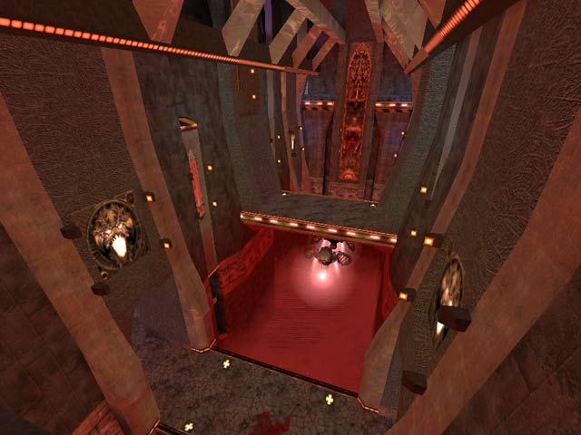
Back when this was released I bet it was a hit. It is a "crafty" map as mentioned; unusual choices all over the place combined with some traditional-looking areas.

But in 2026 this map is far more frustrating and gimmicky than it is good. You spend more time flying across the map hunting for items than you do your opponent - largely because the paths to get the items requires knowing which specific jumppad takes you to which small, enclosed area, which has the item, which then has one jumppad out.

My impression was more misery than novelty.

1
Reaction ~ Reply ~ Report
does it need saying that the openings for the pads are way too small? yes, i think it does. tricky to navigate but otherwise a pretty crafty map.
Reaction ~ Reply ~ Report
Anonymous
18 Jul 2005 #38
I have been playing quake for years now and have only recently noticed that people can fall into the red mist on dm11 where megahealth is and live, they run around down there camping and shooting everyone, could you please tell me how this is done so i can get my own back on these mofo's >:-D
Edit ~ Delete
Nitebeat
4 Apr 2003 #37
Like the feel of the map though, that's why it's still in my base folder...

Haven't tried playing it with the 1.32 bots yet.. (they've improved a lot imho)

Maybe this time they'll jump over the "chasm" to get to the weapons.. and back -_-

Edit ~ Delete
dezperado
8 May 2002 #36
...if i only could keep track of the people downloading this mappie i would torment them requesting comments.. :)
Edit ~ Delete
Nitebeat
25 Dec 2001 #35
Hm map looks ok.. prolly good against humans. Bots play like shit and fall in the chasm every five seconds...

Edit ~ Delete
pociaz
13 Apr 2001 #34
you're great, Mike!! See you soon, I hope! :)
Edit ~ Delete
dezperado
27 Jul 2000 #33
what a summer! i must finish that new map.. dez stop fooling around girls....... people enjoy summer!!!!! no neeeerdzzzz!!! go on!

ciaoooo

Edit ~ Delete
Binaryshi
22 Jul 2000 #32
Waited a while to give "Tienal Talavista" a vote. Thought, maybe in time I could get used to the looks of it. But I couldn't. Mather of taste I guess. On the other hand, the gameplay and setup has some nice and unique features that works very fine.

8/10

Edit ~ Delete
dezperado
22 May 2000 #31
wow, i didn't expect such success. =)

if anyone knows/owns a server with my map running, can he notify me?

thanx

Edit ~ Delete
Rave
7 May 2000 #30
Laura eres de italia???

I bet you are! :oB

Yep dezperado many mappers are kind of scared too place pictures of women in their maps.

Stylish ones you know......;)

Chickens do not have fingers...

Edit ~ Delete
Rave
5 May 2000 #29
I like the idea but it should be more medieval-organic-decadent-satanic-religious-ancient-nutty-girly-bloody style :)
Edit ~ Delete
dezperado
3 May 2000 #28
thanx Rave, i hope to build a good map this time, but i tell you first, in a more organic-medieval-decadent-ancient-satanic style.

what do you think of the idea? in a week i'll post the beta somewhere.

Edit ~ Delete
Rave
3 May 2000 #27
Dezperado one more thing!

I love q3dm18. I think, when it comes to the mood of a map, this one defenitily cuts the cheese :)

I mean first time i took my steps in that map, I was blown away...! Very very dark mood and the lighting only made it better.

To be honest, I think it's the map I play most of all. DOn't know why, it's just fantastic.

This one comes from a poet's dream. you know :))

Edit ~ Delete
Rave
3 May 2000 #26
Too dezperado

Look man; afcourse people are going to comment about your map and the next ..;

but don't let all those negative comments get to you.

Personaly I think the pic was good and i can guarantee everyone i don't have bad taste when it comes to art.

no i don't! :b

NOw it's up to you to do what you promised :)

Edit ~ Delete
dezperado
2 May 2000 #25
ok the next map will be veeeery playable, maybe too much.

but ,sincerely, do anyone got a new feeling in my map? -mean, new style, not the same old .

i liked very much ,for example ,the style of q3dm18.

symply, technogothic (dark colors, with very very high arches and mist)

Edit ~ Delete
Tyre
2 May 2000 #24
Hated this one.

  1. Looks - mixing space and gothic has never worked and it doesn't work here. Also, though there's obviously a lot of work gone into the detail, there's no aesthetic harmony. It looks cluttered. And it lags.

  1. Gameplay lacks totally. The ratio of instant death area to playable area is far too high. One spends more time wondering how to get off the tiny ledges than one does looking for an opponent. If I want tricks and puzzles, I'll play Tomb Raider, thank you very much. DM games are about wasting the opposition, not trying to figure out the right combination of jumps to get from here to there.

I'll not comment on the level pic.

This one got deleted really quickly.

Edit ~ Delete
RaVe
1 May 2000 #23
Yes here for another comment! I guess I'm on drugs tonite. Quake drug ( what a llama joke!)

this map sure looks fine..;(guess i'll have to down it one of these days)

Kutina: I know it stinks when you just have played a map ya didn't like, but give it another shot..or 1000.. it 'll get better. ;)

1000? are you mad????

Edit ~ Delete
Kutina
29 Apr 2000 #22
What drug are you ppl on? This map looks and plays like utter shit. No gameflow whatsoever and the looks arent anything to write home about. Perfect zero.
Edit ~ Delete
sally
24 Apr 2000 #21
I have never seen a gothic cathedral more beautiful then this.do you think you could make a virtual heaven for me? I think that I´ll go on "cazzeggiamento" now!
Edit ~ Delete
dezperado
23 Apr 2000 #20
i am 17 not-so-nerd

i have a 49k connection

i want to say that if you spend so much time in front of the pc , try to spent the rest outside, the life is beautiful, i've been in germany a week ago and i must say that you have a very rich cultural life, compared to italy

/sorry this isn't a chat line/

Edit ~ Delete
Steinecke
23 Apr 2000 #19
Hi, Dezperado.

Because it's part of my job, I'm sitting 5-10 hours a day in front of my machine.

The rest of the day I have to look for my daughter and my two cats.

The average time for playing Quake is 2 hours a day; I'm a very bad player, I guess.

Here, in Germany we are much more interested in bots than elsewhere, 'cause Internet is very slow and expensive.

That toaster-thing was a joke.

Edit ~ Delete
dezperado
23 Apr 2000 #18
/for steinecke/

<misunderstanding>

-no i am male

ehm.. i am italian,and.. what' s the secondary meaning of "toaster"?

(is that beatiful female thing?)

<shame>

/for the rest/

-just for fun, how many time do you spend in front of a computer daily?(me average 5-6 from ~4 to ~(don't laugh)16

1
Edit ~ Delete
Steinecke
22 Apr 2000 #17
Oh, little Dezperado... -I really don't see any reason, to put my hand in Your toaster. But... You're female? But I hope, You are not half as ugly and illconstructed as Your dezperade map is?

No. I' not interested in Your offer. Nothing dirty. If Your toaster is constructed leke Your map is... I would have to go to a doctor, after all...

Edit ~ Delete
Jim
22 Apr 2000 #16
Very nice architecture and styling. The layout takes a bit of time to get used to, but the uniqueness of it will keep this one around for a while. I also like the 1-way "forcefields" that you can go up through by means of a jump pad, but can only stand and look through them when your on top of them.

Now I managed to find the BFG without much trouble, but how d'ya get that quad...?

Edit ~ Delete
KPB.neXus
21 Apr 2000 #15
Awesome map, I like the ample spaces and the gothic architecture & colors. :-)
Edit ~ Delete
dezperado
21 Apr 2000 #14
>ok,lesson learned ,the map i am currently working on is much more easy to play.

>anyway, a good way for enjoying from this map is rocket jumping, try to rocket jump through the force fields, or on the jumpads, and you will get on the top, near the LG.

SELFDESTRUCTION!!!!!!!

>too dezperate, steinecke is right :-<

Edit ~ Delete
Ray
21 Apr 2000 #13
A really great looking map. But hey! I thought we download maps to play them, not to look at them. Graphics 8, gameplay 1.
Edit ~ Delete
Brasco
20 Apr 2000 #12
Love the one way forcefields - excellent idea. Tended to fall of into the red mist a bit too much but thats probably cos I played it when drunk.
Edit ~ Delete
pjw
19 Apr 2000 #11
Wow, if your idea was to make an original looking map, you have succeeded!! Like most of the other respondants, I just wish the gameplay was on the same level as the originality. I will certainly be watching for your next map and crossing my fingers for better flow/play.
Edit ~ Delete
Niptlar
19 Apr 2000 #10
The main problem with this map is the flow; some of the jumps are really tough to make (namely to the ledges in the walls), and there isn't enough roaming room. The BFG thing is okay, but every other jump (except the one to the Quad) needs to be easy to make; that way people (and bots) can jump and fight at the same time.

Good otherwise, but the mediocre flow killed the gameplay.

Edit ~ Delete
dezperado
19 Apr 2000 #9
4 dark cheetah - i found that picture on a stupid italian mail-shopping magazine.you can obtain a bigger version of that at dezperado.supereva.it/gfx.htm

4 steinecke - if the bots are too easy , try to play with one hand tied to the toaster!

(seriously; i think the layout is too strange for proper bot navigating, i tried all the special brushes ,it helped but not so much).

Edit ~ Delete
Steinecke
19 Apr 2000 #8
I'm always using bots at hardcore, Dezperado!
Edit ~ Delete
Gianluca
19 Apr 2000 #7
fa tutto schifo!suicidati e scavati la fossa visto che hai una rivoluzione in testa! Naturalmente scherzo hai fatto un bel lavoro complimenti!
Edit ~ Delete
Dark Cheetah
18 Apr 2000 #6
Ok, This is definatly one of my top 5. This map is perfect inallmost everyway. The item placement is great, the layout is great, the look is beautifull, and the level as a whole is just awsome. I tried my hardest but I really couldn't find a flaw, except maybe one thing. WTF IS UP WITH THE LVL PIC?! WHAT IN THE HELL IS THAT!? =) It had me laughing for a while =)
Edit ~ Delete
simona
18 Apr 2000 #5
sei sempre il migliore secondo me, lasciala stare tutta stà gente che fà commenti:sei tu il + bravo e basta!
Edit ~ Delete
dezperado
18 Apr 2000 #4
sorry but in that moment it was my only idea to make a ^original^ looking map.try the bots at hard skill i think they play better.

thanx for the comments,i'll try again.

the headache was the purpose of the map ,the name "tienialtalavista" means "hold up your eyes" (and then down)

8-)

Edit ~ Delete
OO7MIKE
18 Apr 2000 #3
Beautiful looking map! Dezperado really knows archatecture, eye candy and how to make a map that looks like there is more to it..but really isnt. Not really playable. Best to just look at. I was really hopping that it was a fun map..oh well. Try again DEZPERADO!!! 4/10 Its just so damn pretty!
Edit ~ Delete
Steinecke
18 Apr 2000 #2
There is a trap for suicidal bots; unfortunately all bots become suicidal in this map, so it is unplayable with bots, the aas is useless. This map looks interesting in a... strange way. -Somehow dezperate!?!
Edit ~ Delete
Aramis
18 Apr 2000 #1
It gave me a really really bad headache for some reason.

Edit ~ Delete
Theme:
Bots:
Textures:
Not set
Comments:
40 comments (237 days ago)
Ranked:
Downloads:
5,877 & 325 LiveViews (daily avg. 0.64)
File:
dez3dm2.zip, 1.46 MiB
PK3 date:
12 Mar 2000
..::LvL ID:
NewerOlder

Map history:
Clear
    ..::LvLExplore
    Search history
      ..::LvL Markdown
      The following syntax can be used to format comments.
      Close

      Loading...

      Map Search

      Search for a map.

      Results will appear here.

      Map peak