Added 16 May, 2015
Comments
Add a comment
**Preview only**
Be sure to submit your comment
Be sure to submit your comment
Submitting comment...
@daux - The ..::LvL version is the most recent release with a BSP date stamp of 10th Jan, 2015. The other version has a BSP from 3rd Dec, 2014.
You could always use D!ABLO's map-editor RC4 - lvlworld.com/mod/id:48 - to change the items if you want.
Agree (2) or Disagree (0)
EDIT: Thanks for clarifying @Tig ! :D cool tool btw. I'll keep that in mind.
Very well made map! I enjoy it the most in 2v2. I would like to mention that there is another version (older, thx Tig!) of this map with different item placement on Worldspawn. Most notably it lacks battle suit but adds quad. I prefer that one. :))
Edited 2.65 hours after the original posting.
Very well made map! I enjoy it the most in 2v2. I would like to mention that there is another version (older, thx Tig!) of this map with different item placement on Worldspawn. Most notably it lacks battle suit but adds quad. I prefer that one. :))
Edited 2.65 hours after the original posting.
Agree (2) or Disagree (0)
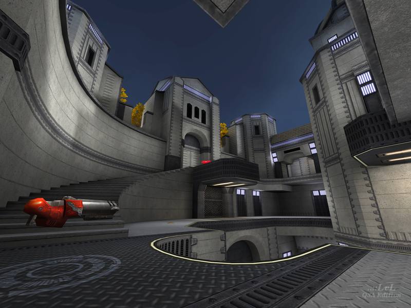
This map is excellent in each mode: TDM, FFA and Tourney. I like the distribution of weapons, items, and the different floors on the map.
I think the corridors and connection of the whole map are splendid, besides the textures are simple but well used. Marvelous experience with Pat Howard's maps.
I think the corridors and connection of the whole map are splendid, besides the textures are simple but well used. Marvelous experience with Pat Howard's maps.
Agree (1) or Disagree (0)
@IconoDelPecado:
Check if there is a file named goldleaf.arena or whatever with extension *.arena in the scripts folder inside the pk3 (you can open it with any free zip software, I'm using 7-Zip for this). If there is, examine its content. Open it in notepad and check if there are correct gametypes listed: correct list should be "ffa tdm tourney". If it is, it should be playable from Skirmish menu (unless you have too many maps in your baseq3 folder - the Skirmish menu has a maximum load, which is far smaller than how many maps you can actually load with console). Try moving some maps from baseq3 into a backup folder (if you want to play them later). It may free some space in your Skirmish menu to load more maps.
Check if there is a file named goldleaf.arena or whatever with extension *.arena in the scripts folder inside the pk3 (you can open it with any free zip software, I'm using 7-Zip for this). If there is, examine its content. Open it in notepad and check if there are correct gametypes listed: correct list should be "ffa tdm tourney". If it is, it should be playable from Skirmish menu (unless you have too many maps in your baseq3 folder - the Skirmish menu has a maximum load, which is far smaller than how many maps you can actually load with console). Try moving some maps from baseq3 into a backup folder (if you want to play them later). It may free some space in your Skirmish menu to load more maps.
Agree (0) or Disagree (0)
i can't see this map in the game, i have to load the map using console commands, can someone help me with this?
Agree (0) or Disagree (0)
This is a very under-stated map - in a good way. I like the placement of weapons and items, although it really could use a grenade launcher, and really I like the inclusion of the battle suit although it is not included in TDM (or as are location entities for team play). Nevertheless the layout makes it a whole lotta fun to play.
Edited 1365.51 days after the original posting.
Edited 1365.51 days after the original posting.
Agree (1) or Disagree (0)
This map reminds me of Shibam a little but I have to say this looks really good. All your maps are anazing Pat so I'm looking forward to play this one!
Agree (0) or Disagree (0)
@CZGhost thanks for the review!
@obstroq: thanks for the nice feedback. i'm glad you like the layout and think everything is nice and refined. i spend a lot of time in the planning phase of my layouts to try to get them to feel like that.
Agree (2) or Disagree (0)
A cool and polished map with open feeling and fine layout. Nice to see the latest contest maps coming in now.
You have really a variety of pathes while playing and dm never gets boring here. Everything feels in correct place, clean and details are perfectly integrated: moving trees, small pieces of ground, outside the arena, the leafes on the ground and a perfect fiting skybox. Although a tek theme meets a classic theme (from my view), everything seems as if made from one piece and homogeneous. Simply great work and must for collectors.
You have really a variety of pathes while playing and dm never gets boring here. Everything feels in correct place, clean and details are perfectly integrated: moving trees, small pieces of ground, outside the arena, the leafes on the ground and a perfect fiting skybox. Although a tek theme meets a classic theme (from my view), everything seems as if made from one piece and homogeneous. Simply great work and must for collectors.
Agree (2) or Disagree (0)
