**Preview only**
Be sure to submit your comment
Roger
unregistered
#12 19 Apr 2000
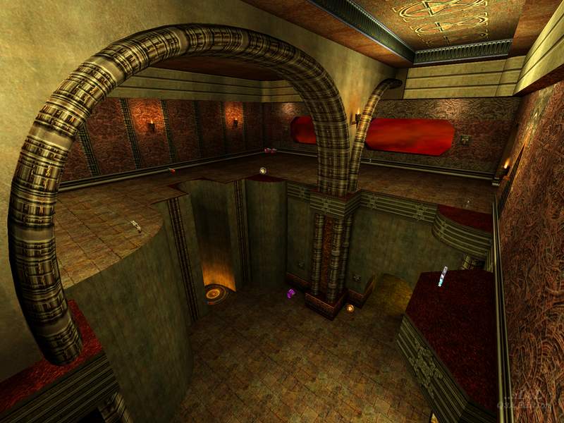
The only bit I found really lags is the jump pads on the top level. If you have to hunt for action, add some more bots! One of the things I like about this map, other than the excellent architecture, is that the play does seem to spread over the whole map; often it seems to concentrate in a few places in some otherwise good maps. My chief objection is that the vertical connectivity could be better: once you are up on the top level there's no way down except a painfully long jump. Short of putting in some more stairs, there's plenty of room for a 1-way teleport from the top level to the cellars, which I think would improve the gameplay.
Agree (0) or Disagree (0)
Gauloise
unregistered
#11 09 Apr 2000
this map rules :)
Agree (0) or Disagree (0)
Hubster
unregistered
#10 06 Apr 2000
to Waspy
:P
bout time u made it ere man:-)
Agree (0) or Disagree (0)
[Kona]
unregistered
#9 06 Apr 2000
Nice level. I didn't even notice the backward textures :P
Nice layout too, although for some reason the bots got slaughtered. i guess cos they always messed about down below while i gathered the railgun, rl and mh. maybe the rooms were a tiny bit too big too. othersise good stuff.
Agree (0) or Disagree (0)
WaSp
unregistered
#8 05 Apr 2000
sorry OozE.....wasnt me :-)
and Hubster.....who the fuck is buddy :-)
Agree (0) or Disagree (0)
0ozE
unregistered
#7 05 Apr 2000
Wasp, didn't u make a custom map for q3test? It was a tourney...was that you? If it was, you should redo it for Q3 final...I liked that one alot better. If not, 'oops!'
;)
Agree (0) or Disagree (0)
Hubster
unregistered
#6 05 Apr 2000
Wasp, you blow buddy.:P jk
Agree (0) or Disagree (0)
ShoveL
unregistered
#5 04 Apr 2000
Excellent stuff Wasp!
your skills are realy maturing now...
I like the choice in texturing, very original
Keep up the good work
I gave you a 7!
When are we gunna see that new piece you sent me pic of, it looked awsome! ;)
Agree (0) or Disagree (0)
Rokscott
unregistered
#4 03 Apr 2000
Not a bad layout and very interesting use of textures and well lit as well.
Unfortunatly a bit too laggy for my low end system.
Still cool though.
7/10
Agree (0) or Disagree (0)
Dutch
unregistered
#3 03 Apr 2000
The map is very nice to look at though the jump pads do seem out of place with the rest of the architecture.The bots get around ok , but the gameplay is very average. I give it a 6.
Agree (0) or Disagree (0)
Quaker-X
unregistered
#2 03 Apr 2000
a pretty good map i thought. the jump pads are funny how they are backwards hehe. i would have made it all gothic though and not put any base in there, but thats me. good map, i give it an 8
Agree (0) or Disagree (0)
wasp
unregistered
#1 03 Apr 2000
thanx for the review :-)
just a word on the launchpad textures.....after I released TANTRUM ,a few friends pointed out the backward texture and the overall "shitty" design of the launchpads.
this was an error.....but after a LOT of laughs :-)......
I decided to keep them this way....all future maps will have this design...I may loose points...but its a quirk I kinda like :-)
Agree (0) or Disagree (0)

