Added 09 Jun, 2011
Comments
Add a comment
**Preview only**
Be sure to submit your comment
Be sure to submit your comment
Submitting comment...
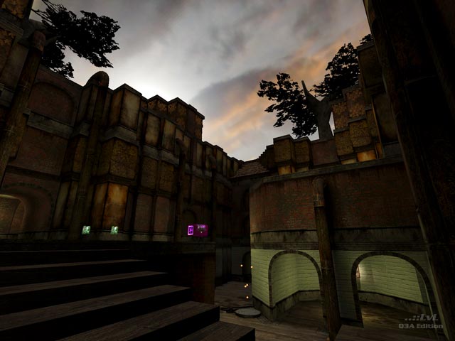
The map has a really cool aesthetic and it really is well put together, but I find the layout to be a little cramped and the birds chirping in the central area will drive me crazy after a while.
Agree (1) or Disagree (0)
Some parts of the map have similar textures to 'Corrosion By ShadoW'. This map is very well constructed and has many areas to explore. It's a keeper!. 9/10
Agree (0) or Disagree (0)
Very nice theme (if you like this kind of thing), shows a lot of progression from dONKEY
Agree (1) or Disagree (0)
Very well done. Probably one of the best Steampunk style maps in Q3. You gotta love those jump pads with the leaves blowing in the air.
I was never sure about the steaming pipe used as a teleporter, though. I like the "think outside the box" thing, but it should be more obvious as a tele IMO, some will not even know it is until someone accidentally steps into it. I thought having RA and MH in the this map was okay - very small cramped maps like Aerowalk incorporate both and work fine.
Agree (0) or Disagree (0)
This one deserves a more detailed review, I don't think it's a kind of map that you can describe in just one short paragraph.
I like the aesthetics, very well done. My only "complaints" would be that some parts are a little bit too tight, and that both the RA and the MH are a little bit too much on a map this size.
Agree (0) or Disagree (0)
I definitely don't like donkey's graphics, but here its is becoming much more interesting.
Agree (0) or Disagree (0)
This comment is to be deleted since it was a reply to an off-topic comment and the person I was replying to had their comment removed.
Edited 1167.21 days after the original posting.
Edited 1167.21 days after the original posting.
Agree (0) or Disagree (0)
It is a little dark. I go with fistmarine. 7.5/10
Agree (0) or Disagree (0)
I really liked the leaf-blowing effect over the jump pads. In fact, that's why I downloaded this map in the first place. If you made the trees have yellow/orange/red/brown leaves falling from them and better lighting, I would have kept it.
Edited 1168.16 days after the original posting.
Edited 1168.16 days after the original posting.
Agree (0) or Disagree (0)
