Added 05 Sep, 2009
Comments
Add a comment
**Preview only**
Be sure to submit your comment
Be sure to submit your comment
Submitting comment...
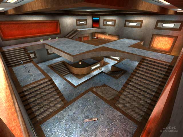
A tiny map with very intense gameplay. In fact, a bit too intense. There is no time to pick up most of the weapons and timing the red armor is difficult. The design is nice though. A x1.5 version of the map could turn it into a total blast.
Edited 35 seconds after the original posting.
Edited 35 seconds after the original posting.
Agree (1) or Disagree (0)
No prob man.
I'll may put up my next map up there for beta, thanks for the invitation.
I'll may put up my next map up there for beta, thanks for the invitation.
Agree (0) or Disagree (0)
come over to the level editing section at www.quake3world.com. there are bunch of us mappers who will be able to help you out if you are having any difficulties. after re reading my comment it does sound a bit harsh.. sorry.
Agree (0) or Disagree (0)
I know these maps of mine are not the best work here on ..::LvL
That's not my intention, i'm trying to make small, full of action, funny and a bit twisty kind of maps.
It is something I do foremost just for myself and sometimes I like to share my creations.
And man, I love and enjoy ..::LvL for many, many years now.
That's not my intention, i'm trying to make small, full of action, funny and a bit twisty kind of maps.
It is something I do foremost just for myself and sometimes I like to share my creations.
And man, I love and enjoy ..::LvL for many, many years now.
If you don't like these maps I'm ok with that.
I've worked a long time on these maps, I'm not a great nor a fast mapper and still learning here.
It took me over a year to complete these two little maps...
I've rebuild them many times and searched intensly for the textures that I found fitting.
The water behind the glass thingy is just a funny twist and q3map2 does some fine lighting-work with it (IMO).
In short, there is effort, time and energy put in and spend on these maps...
this is what I do and I like it.
Agree (0) or Disagree (0)
i have to say im not a big fan... it seems more like the designer is lazy and not really trying to do anything. its a box map... end of story. but it seems to be a theme of his... come on dude, put in a little more effort. and as for the gfx.. i dont understand them... whats with the water behind glass set into the walls for no reason...? 6/10
Agree (0) or Disagree (0)
