**Preview only**
Be sure to submit your comment
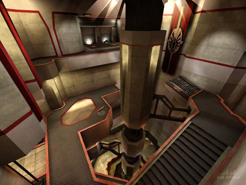
I kinda agree with Aeon on this one. I actually really like the creativity behind fkd's verticality but the atriums could be wider and less cramped, and the map more spread out by building in more areas instead of being restricted to the two atriums and 1 small connecting room. but the choice of texturing and the design is still really nice.
Agree (1) or Disagree (0)
why this doesn't have a rating of at least 4 is bullshit
Agree (0) or Disagree (0)
10/10 Straight!
Agree (0) or Disagree (0)
Iván
unregistered
#33 20 Dec 2011
Beautiful map, excellent work.
Agree (0) or Disagree (0)
The details of this map are impressive and the architecture is beautiful. The red rims go well with all of the different textures throughout the map. Item placement is extremely good with the Megahealth being placed in a well designed area and great connectivity throughout the map.
Really nice map fKd, 9/10.
PaN61
Edited: 20 Apr 2010 AEST
Agree (0) or Disagree (0)
garoto
unregistered
#31 17 Nov 2009
The concrete gray and red rims reminds a lot of Ikka's "Future Brownie" map (ik3dm1). Which is great, since I love the style.
Agree (0) or Disagree (0)
Mikko Sandt
unregistered
#30 08 Oct 2009
Pat, it doesn't matter for as long as everyone is free to do so. With enough votes, the average vote is close to its actual value whether a few individuals exaggerate their scores by a lot or not.
Agree (0) or Disagree (0)
Honestly I never liked the 1 - 10 rating system. It's obvious that some people are going to exaggerate their votes in order to get the overall rating closer to what they think the map should be.
I think a Like/Dislike with a confirmation button would be a lot better.
Agree (0) or Disagree (0)
Maybe an accidental click. The voting process is a little bit too easy. A confirmation popup with a cancel button would be really nice.
Agree (0) or Disagree (0)
wow, i know its not great... but 1 out of 10? hmm i think i need a thicker skin
Agree (0) or Disagree (0)
17/8/09 - 29/9/99 and still no review, come on ppl :D
Agree (0) or Disagree (0)
you will find it in the map queue here.. sorry i dont quite understand what you mean..
Agree (0) or Disagree (0)
monaster
unregistered
#24 25 Aug 2009
Hey there fKd, since you seemed to have finished your new map over at q3w: any idea when it will be published at lvlworld? Definitely deserves to be provided to a somewhat "bigger" audience (compared to mediafire) in my opinion! ;)
Agree (0) or Disagree (0)
Very well designed architecture and texture choices. Alas, I am not much a fan of vertical maps, and the central shaft gets a tad too crowed and cramped for my taste. I'd have preferred to have a map of this style spread out horizontally more.
Agree (0) or Disagree (0)
ok...
Agree (0) or Disagree (0)
I will give it a try :)
Nice idea zihaben, this may make lvl::.. so much more popular again.
PS: I have to agree with fkd. Though, your maps are awesome too fkd ;)
Agree (0) or Disagree (0)
fKd
unregistered
#20 10 Aug 2009
just come over the the level editing forum at
www.quake3world.comps zihaben your maps are amazing!
Agree (0) or Disagree (0)
"we q3 mappers need to stick together "
May be, we should make petition and ask Tig for forum on LvL? ;-)
Agree (0) or Disagree (0)
zihaben
unregistered
#18 10 Aug 2009
@Gio: just google for any of your question, I'm sure you'll find HUNDREDS of answers. Begin with "quake 3 shader manual" ;-)))))))
Agree (0) or Disagree (0)
Gio, questions like these are better for level design forums rather than review websites. Try a website like quake3world.com and you'll get better feedback.
-Pat
Agree (0) or Disagree (0)
Tig, how can i create a texture?
I have q3ase but i don't understand the manual... i don't know how to load an image and animate it...
can u help me? :)
Edited: 10 Aug 2009 AEST
Agree (0) or Disagree (0)
ok big thanks (again) :)
Agree (0) or Disagree (0)
@Gio: Check the ..::LvL F.A.Q., there are details instructions on how to start a map there. The link is under Site -> F.A.Q. at the top right of the site.
Agree (0) or Disagree (0)
i don't see any ..::LvL's map in skirmish.
i start my maps with the console,
i write:
g_gametype 12
map q3dmp9
But the map doesn't start...
the map lifeline start and i can play it,
the map acid3dm9 start... :-|
Agree (0) or Disagree (0)
fKd
unregistered
#12 08 Aug 2009
extract q3dmp9.zip into ya /quake3arena/baseq3 folder
start quake 3
click single player
then click skirmish
then scroll to the right until you see q3dmp9
click on the map so the name is shown in between the back and next buttons
click next
click fight
done
with any luck it should work :)
Agree (0) or Disagree (0)
i don't know?? sry but i don't know which mode i am
Agree (0) or Disagree (0)
That's strange. Perhaps you're in CTF mode? Don't know what else could be causing that, sorry.
Agree (0) or Disagree (0)

Gio Rep. 0
#9 08 Aug 2009
the console load the map but doesn't start the game,
any error messages.
Agree (0) or Disagree (0)
we q3 mappers need to stick together
I agree with you fkd. I started mapping and it was quite hard to find answers on my questions. As newbie I didnt/dont know where to find other mappers with more experience to ask my questions.
Agree (0) or Disagree (0)
fKd
unregistered
#7 06 Aug 2009
thank you sir :)
do you go to quake3world? i've not seen you on the forums. since level makers is gone you should come over and share ya work and help the mappers :) we q3 mappers need to stick together
Agree (0) or Disagree (0)
Gio, First off you should be able to find the map in your skirmish menu if you put it in your baseq3. Second, if you want to load from console, type -
/sv_pure 0
/devmap q3dmp9 OR /map q3dmp9
If that doesn't work, what's the error message you're getting?
fKd, One thing I noticed that was really sweet about this map is the lighting on the walls up near the top. The spot lights + the shadows cast by those wires is amazing. I kind of wish it was more obvious so people would see it even while playing, but now that I know it's there it's a nice subtle feature.
-Pat
Agree (0) or Disagree (0)

Gio Rep. 0
#5 05 Aug 2009
the console can't find the map .bsp :(
Agree (0) or Disagree (0)
fKd
unregistered
#4 02 Aug 2009
this is nothing compared to q3dmp11 muhahahaha
Agree (0) or Disagree (0)
051R15
unregistered
#3 22 Jul 2009
This map causes a texture corruption problem in other maps for some reason (specifically bounce pads in ID maps).
Too bad, because it's a solid map... but I thought I'd save some one else the headache of figuring out which of their hundred or so custom maps is screwing things up....:(
Agree (0) or Disagree (0)
fKd
unregistered
#2 13 Jul 2009
Thanks for the review. all valid points :)
Agree (0) or Disagree (0)
Anonymous
unregistered
#1 12 Jul 2009
beautiful architecture. great connectivity. i will agree with the review that there is not enough health, but i have no problem with the item placement other than that. awesome map
Agree (0) or Disagree (0)

