Added 22 Jun, 2008
Comments
Add a comment
**Preview only**
Be sure to submit your comment
Be sure to submit your comment
Submitting comment...
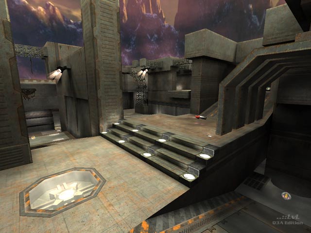
This is what i'd call a bully map and while this automatically gives it a 10 for me compared to others of it's style it scores a little lower considering it is lacking some pretty speccy jumps in key areas. all items are placed to be collected at speed, and/or from a rocket jump. the weapons are generally placed more visibly so they can be picked up from a jump or missed at the midpoint of a jump depending on the direction you are travelling from. the ramps and stairs are always scaled to be hit at speed. a key example is the positioning of rl in relation to the ramps. because of this a bully map will always have space and 2 rocket launchers. although the space is more open a railgunner will be working with faster targets and will his/her self be aiming while moving at faster speeds. the accelerator pad/rail/rocket/mega is nicely set up as are the moves to the armour. a battlesuit on this map could have really helped to beef things up here. to scale it down and move the items to the edges would turn this into one of those small edgey tourney maps that are somewhat slowed down in their pace, if not their hits, and turn this map into something that it's not. a ten for being bully but an 8 for not being as bully as it coulda
Agree (0) or Disagree (0)
@Tig: LOL, you got one-shotted by a machinegun by bones.
Anyway the map reminds me of one of the Quake 4 (demo) MP maps, and the backdrop looks like mountains in the Arctic... brings me back.
Agree (0) or Disagree (0)
Its both re-textured and re-organized. The new version is much tighter and has different hallways / routes, its more just inspired. Originally I was going to make this a candidate for a QL icon but decided against it because the two maps were so different.
Agree (1) or Disagree (0)
@EmeraldTiger: Are you saying 'Concrete Palace' on QL is this map, but re-worked? Should this map have a QL Icon?
Agree (0) or Disagree (0)
I agree, this map feels somewhat overscaled, it almost doesn`t look like a duel map at first glance, but a CA map. Fortunately there is Concrete Palace from QL, which revises the layout whilist keeping a sense of familiaraty.
Course you have to pay for it... still :-)
Agree (1) or Disagree (0)
@Aeon: Maybe more like 1.5 but I agree that the scale ain't perfect. It's still a very cool map though.
Agree (0) or Disagree (0)
Interestingly the map feels over-scaled, IMO. It would be an interesting experiment to scale down the map by a factor of 2, that should still yield a quite playable (I am guessing actually a better) map, that is more concentrated. Presently the player is kind of lost on all those extremely wide paths, with those very high ceilings.
None the less, I very much like the style and lighting of the map, and the bots are fun to play as well.
Edited: 23 Aug 2009 AEST
Agree (1) or Disagree (0)
