**Preview only**
Be sure to submit your comment
thanks :)
Agree (0) or Disagree (0)
@wakey, SW12: I've added a download link to the review that links to the music version.
Agree (0) or Disagree (0)
@SW12: Unfortunately the version with music got lost in the depths of the net, and my own copy is also lost :-(
But if you want to hear what song it was, heres the link:
www.scenemusic.net...bes/song/18616/In fact it's also called Passing Uranus and was the inspiration for this map ^^
Agree (0) or Disagree (0)
Dwint
unregistered
#13 21 Jul 2011
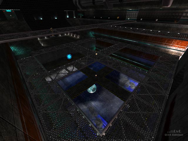
Great map, but it's too dark to be played.
Agree (0) or Disagree (0)
SW12
unregistered
#12 16 May 2011
Where is the version of this map with music?
Agree (0) or Disagree (0)
@abcdefghijklmnopqrstuvwxyz: yep, there is another map(pack) by me, called Winternacht & Sommergewitter.
Also in the map queue you find a file named beneath.zip, thats another map i made, called Beneath the Waves.
nice name btw ^^
Agree (0) or Disagree (0)
yeah!
Agree (0) or Disagree (0)
abcdefghijklmnopqrstuvwxyz
unregistered
#9 13 Jun 2010
Did wakey make any other m maps than this?
Agree (0) or Disagree (0)
SW12
unregistered
#8 01 May 2010
Sounds interesting. I think I may get a "sneak-peak at it since I AM interested in what other masterpieces you have made. Good job on this one.
Agree (0) or Disagree (0)
SW12
unregistered
#6 12 Apr 2010
I like this level. A starship-theme with nice detail. The HUD Is also authentic to go with it. Engines look cool too. When I was denied access of the sealed doors, I got desperate. I did the evil; used cheats to find out. But don't, you will get disappointed. But good. Also you really have to watch yourself in the Engine cooling Room; Apparently there was a leak causing Lots of coolant to leak out. But a MH is there so go there anyway. Nice level.
Agree (0) or Disagree (0)
The theme of some maps do not lend themselves to the best game play because their inherent design is a creative expression of its author. Often a decision must be made in favor of form over that of function. This map is stunning, and although game play is not superlative, I still rated it 9/10.
Agree (0) or Disagree (0)
Wakey, Thank you for directing me to this map (from your response to my comment about your map, Winternacht & Sommergewitter) as I do, most assuredly, esteem maps with such realism. Some of the inaccessible doors were so convincing that I also found myself wanting to gain entry. I also really appreciate the sky box with one of Uranus' moons, I believe it's Ariel, as it seems to help the ambiance of the arena and the apportionment of detail. I hope that you continue to design more maps because you show so much skill; I wanted to offer some small suggestions that might serve as an insight into what many players are looking for in maps and how they often judge them. Here are some basic guidelines that may serve as a rough framework for designing and assessing maps:
- Originality (How unique is the map, including new textures, sounds, design, theme, special features, etc.?)
- Ambience (How immersing and convincing is the pervading atmosphere?)
- Game play (Does the map lend itself to playability? Is basic Quake 3A supported and/or one or more diverse game types and or mods including, but not limited to Team Arena, De-frag, CTF, RA, and CPMA?)
- Realism (Is the environment believable, how much detail and diversity of elements does it contain, i.e. plants water features, fog, rain, landscape, convincing architecture, etc.?)
- Bot Play (Are bots supported, are there sensible area(s) where they might camp and how well do they emulate the actions and the intelligence of a human opponent?)
- Technical Issues (Are there any significant errors that affect any aspect of the proper functioning of the map or one or more of its components?)
- Weapon, ammo, health, and item complement and placement (Do the included items and their placement and/or rotation facilitate or hinder game play?)
- Staying Power (Does the map continue to be a relished diversion after long term game play; is it worth keeping and does it compel one to play it frequently?)
- Basic Functioning (Does the map zip correctly to the baseq3, does it appear in the menu and work properly and at an acceptable frame rate such that most reasonably up to date systems can run it well?)
10) Overall impression (Does it have that WOW factor, what is one’s gut feeling after playing the map? Here is where we find the intangible element(s) that influence our judgment of the map.)
11) Lighting (Does the Lighting accentuate the look and feel of the map without affecting the game play too adversely. If the lack luminosity was specifically intended as an influence to employ a unique strategy in the game, was that fact conveyed in the read me file and was it apparent that play with bots was adequately considered and addressed?)
12) Scale (Was the map designed to the correct scale or was it used effectively as an intended feature of the map?)
Please do not infer that any of the above criteria are sorely lacking in this map, I simply wanted to be as inclusive as possible and I trust that you will take my advice in the spirit of goodwill in which it was intended. I also realize that often where an author strays from these guidelines the gift of artistic license may often take over with miraculous results. I appreciate your existing contributions to Quake 3 and anticipate the opportunity to see more from you in the, hopefully, not too distant future.
(I almost neglected to ask where I may download the version with music)
Where may I download the version with music? ;)
Edited: 07 Mar 2010 AEST
Agree (0) or Disagree (0)
Essentially a box map in space with some steel grate catwalks. i don't mind the darkness but the rooms off the main arena are underutilised with doors that don't open or lead anywhere. spawning in these locations was wasted fragging time as i made my way back to the central arena. due to its size the rail gun is needed here but frustration is just compounded by the fact that the grille in this area cannot be shot through leaving me watching as a clear shot passes by.
Agree (0) or Disagree (0)
It looks interesting and has some nice custom shaders and yes, it is dark. But not too dark to see your enemies on my system. Anyways, I think it is justified to say that the map doesn't play too well and was designed more with aesthetics in mind (as Wakey's last map was).
Agree (1) or Disagree (0)
Cendres
unregistered
#1 26 Mar 2008
I personally have no problem with gameplay. Bots play the level well, and even if the map is way too dark, colors and atmosphere are beautiful. Play it in the dark, and you will have no problems to find the entrances. The two power-ups (Haste and Invisibility are easy to grab, while the MH is stuck into the acidic green slime.
A well-done map, a real change amongst the others, with an interesting soundtrack. Looks like some places in Quake IV.
Also interesting with customized bots by other mappers: Zapper, Plasma, Phyro, Mu-v.1, Claw, Jurael, and others...
Agree (0) or Disagree (0)

