Added 26 Nov, 2005
Comments
Add a comment
**Preview only**
Be sure to submit your comment
Be sure to submit your comment
Submitting comment...
Decent. Too narrow corridors. For some reason, it plays very bright.
Agree (1) or Disagree (0)
GL is a very useful in this map. Too symmetrical? A little more colour maybe? But these are very minor nitpicks in a very very good map.
Agree (1) or Disagree (0)
map is wery nice.. i waned to try it on server...but it HAVE bugs ..grafical bugs.. with litghtning on all ok.. but with vertex.. omg corners colons.. all are true visible.. etc..map is interesting i like planing.. but PLZ FIX ...vertex try
Agree (0) or Disagree (0)
First thing I do is check for z-fighting, HOM, crappy clipping and "wallhack with rocketjump", only then what weapons are present, how items are placed etc. I have to admit aside some sparklies and low ceiling clip on the upper lever, map is PERFECT.
Donkey if you are reading this, PLEASE PLEASE raise the ceiling so you can at least fully rocketjump on the upper bridge, and don't forget to texture the top of the ceiling of surrounding rooms so player's won't be able to see thru geometry. I understand you did it low to prevent this, but it damages the gameplay. Thanks.
Agree (0) or Disagree (0)
Fantastic map, that central room is so much fun for fragging in!
Great work dONKEY.
Agree (0) or Disagree (0)
VERY nice design, though I would liked to have seen a bit more rocket play due to the multi-tiered nature of the level.
Agree (1) or Disagree (0)
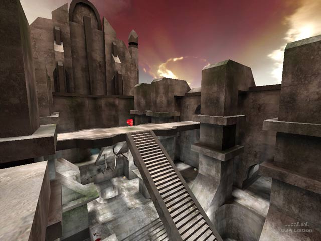
Imagine being sent to a concrete facility, abandoned due to accidents and fights, and seeing blood smeared along the walls and bullet holes everywhere. Pretty scary feeling. dONKEY did just that. Item placement was decent due to the fact that bots roamed the level. Lighting was consistent as said by BFG and well done. Gameplay was excellent. Bots seemed to get weapons then meet in the center section of the map and fight. Pretty cool. I had a fun time. Didn't find a problem with it, I actually liked the concrete texture throughout the level. Gives you an indication that dONKEY made it due to his uniqueness he puts in all levels.
10/10
-J2Kool63
Agree (0) or Disagree (0)
