**Preview only**
Be sure to submit your comment
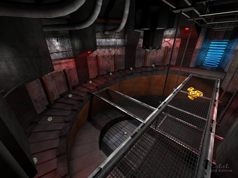
I had a look at the map and it definitively has cool gameplay as well as nice aesthetics. It's well connected too. YA railings is by far the worst design idea. Quite annoying indeed. Not even some trick-friendly shortcut. The jumpad demarcation area could have been a bit clearer too. Item balance feels ok, although is a small map like this one you can do some run to get the three armor in one go (provided timing is right). I played several times and never felt the need for the RL though. GL was something you could not abuse enough. This imo kills the strategic component of the map. At least with suggested bot load, it was carnage all over. This could have made for an even better tourney version imo, replacing one YA with a MH for instance.
Agree (1) or Disagree (0)
... @Tig Aw, Snap! That was exactly the only problem I had with it too, and what kept me from scoring a 5. maybe??? You are very particular, and I understand your choices, but a little love here and there can never go astray. From memory, I suggested 2 and my primary motivation for suggesting those were the gameplay more so than looks, but I don't offer such suggestions lightly. And I don't really question your judgement on these things because the selections you make are solid. I was really interested just to get an insight into your thought process. But, if you reconsidered, I think it might be a great choice. The one thing that puzzled me in the comments was the whole remake issue around this level. I don't think this level bares any resemblance, other than a superficial one, to the levels suggested by other commenters, so I scored fairly highly for originality too.
PS: there is a map I absolutely love for the gameplay and design that has never been featured in the Egyptian theme, that is exceptional in both TDM and FFA (prolly too large for tourney). I will tag you in the comments for your consideration. But I am ALWAYS using it
Edited 10.07 minutes after the original posting.
Agree (0) or Disagree (0)
@HelterSkeleton : Just played it again to see what it was that put me off. Hard to see really :) It is a great map! One thing I found annoying while playing just now was the small details that get you a little caught up. Things like the "bumping" on the stairs, the walkway supports, how you can drop off the walkways in some parts but not other sections. There are some ledges around the main jump "chute" you can land on. Then there is the fence around the Lightning Gun.
Honestly, these are very minor issue and should not put anyone off the map. The game I just had was a lot of fun. Maybe it really should be a featured release.
Agree (1) or Disagree (0)
@Tig I'm really curious to find out what you thought it lacked for it to miss out on the final cut. nice shader effects on this btw.
Edited 43 seconds after the original posting.
Agree (0) or Disagree (0)

Tig Rep. 2902
#9 28 Jun 2017
While looking for the next Featured Release, I gave this map another look. It really is a great release. Just missing the Featured Release pile.
Well worth checking out people. The author has got a lot right here.
Agree (2) or Disagree (0)
obstroc
unregistered
#8 17 Apr 2015
This map is like meeting an old friend again for me. I was playing this little monolith allready in the past and I never could remove it from my collection. It's definitely still one of the most impressive maps in terms of details and lighting for quake 3. It didn't reallyget older for me. It also reminds me to several UT maps, out of the UT2k3 and UT2k4 aera.
(Speaking about this, ... there is also an interesting DM-Rankin remake from UT series for Q3 as found on the following worldspawn archives:
en.ws.q3df.org/map/q3rankin/ maybe anyone likes this one)
Agree (1) or Disagree (0)
Well I'm really fascinated in this map since it's held in a factory and I love factory maps. Excellent gameplay and finely brushed textures plus Framerate is perfect when playing with 4 bots. Nice Work! 7/10
Agree (0) or Disagree (0)
yeah..I like this map quite a bit. I'm amazed with the "not so great" comments.
Agree (1) or Disagree (0)
Nice! Never knew Jex mapped for Q3... I'm only familiar with his work for Tremulous.
Defiantly going to give this one a try.
Agree (1) or Disagree (0)
auLucifer
unregistered
#4 10 Aug 2004
I use to love DM5 from Q1. It was awesome online with about 12 others and the flow was great.
This is an awesome remake and it brought back some good memories. My only problem was the location of the rail. It isn't a bad addition to the level but its location is a pain to get to.
Agree (0) or Disagree (0)
Plextor
unregistered
#3 01 Apr 2004
the lighting is nice, the texture combos were OK for the most part, although some things just didn't seem right
the scale of the 2 main large rooms could have been more refined, they seem to open compared to the rest of the layout
nitin: i believe you mean dm5 from quake 1... which was a horrible map to begin with
although this map is an improvement, like nitin said, it's as good as it can get out of that layout
Agree (0) or Disagree (0)
Q-Fraggel
unregistered
#2 30 Mar 2004
Actually I didn't like the aesthetics of the map not as much as anybody else. The coloured lighting and combination of textures didn't do it for me ...
Nice use of q3map2 features though!
Agree (0) or Disagree (0)
nitin
unregistered
#1 27 Mar 2004
good stuff. The detailing is excellent although it's a fair hit on the framerates on my low-mid range system (thoug it's really high-end enough for q3).
Gameplay is about as good as you can get with the old e1m5 layout.
nice work.
Agree (0) or Disagree (0)

