Menu..::LvLForumExploreSearchProfile avatar

Pacemaker
redfella

Write a comment
Bold
Italics
Small
More...
Preview only
AEon
20 Aug 2009 #4
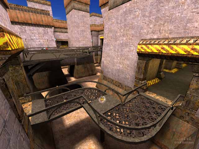
I am a bit torn about this map. On the one hand there are really beautiful areas, like the grated walkways (see the lvlworld screenshot for the map), and the wonderfully sunny upper level. On the other hand there are these gritty to the point of ugliness lower areas, IMO.

The main issues in this map, IMO, are the respawn points that are way, way, waaay too far away from any weapon. It is not fun running around a large map trying to find a weapon. This could well be just "my problem", but I also found the layout confusing. And there are several areas where the player gets snagged, e.g. the grated bridges could have been made a bit wider.
1
Reaction ~ Reply ~ Report
Madan
28 Feb 2004 #3
The gameplay was a bit off but not as bad as the reviewer made it out to be and the aesthetics of the map were both unique and attractive.

Nice job. Keeper.

Edit ~ Delete
redfella
14 Feb 2004 #2
Yea, I really didn't know what I was doing with this one. I just kind of thru it together without much thought to the gameplaytheme etc. I agree, redq3dm2 is better for sure.

I got another coming out asap.

:)

Edit ~ Delete
{DEMO}LITION
14 Feb 2004 #1
Yes, a nice effort for a first map, redfella. But I thought the gameplay was a little off the edge. I much prefer redq3dm2.
Edit ~ Delete
Theme:
Not set
Bots:
Textures:
Not set
Comments:
4 comments (17.15 yrs ago)
Ranked:
Downloads:
2,808 & 323 LiveViews (daily avg. 0.38)
File:
redq3dm1.zip, 7.03 MiB
PK3 date:
12 Sep 2003
..::LvL ID:
NewerOlder

Map history:
Clear
    ..::LvLExplore
    Search history
      ..::LvL Markdown
      The following syntax can be used to format comments.
      Close

      Loading...

      Map Search

      Search for a map.

      Results will appear here.

      Map peak