Added 14 Feb, 2004
Comments
Add a comment
**Preview only**
Be sure to submit your comment
Be sure to submit your comment
Submitting comment...
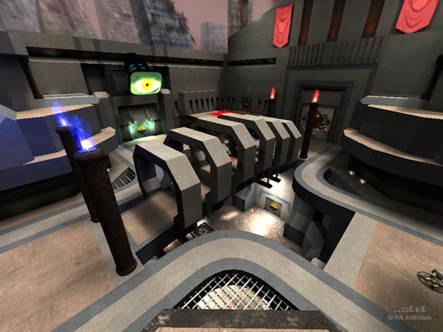
(not a big fan personally myself) but very representative of dONKEY's earlier aesthetic. I knew whose map I was playing on so there is no question here in terms of branding a product. I'm also glad he's toned it down over the years and gone for plausibility and consistency. I get the surreal tip, but in the context of the time (surrealism's era), and also as an enduring aesthetic, surrealism can be more disorienting, disturbing, and unheimlich than it is actually "cool". Many trippers end up in the asylum. As far as the gameplay goes, I was actually really impressed, and the author should be pleased with themselves also. As an experiment in CTF, dONKEY intuitively got it right both in terms of utilising the whole map (no areas feel redundant) and encouraging team strategy. So kudos for that. The cover over the RA bridge is a bit too much. I was really looking for flexibility in being able to get onto and off this platform from all directions. The way it forces players into the bottleneck is a little too didactic, If I may say so. Disembodied eyes really offend my senses. So if I am hanging onto this for the gameplay, I must be impressed.
Agree (0) or Disagree (0)
That makes me feel a little better, thanks, ego is soothed;)
Agree (0) or Disagree (0)
I really thought this map had alot of creativity
I like it alot just thought some parts weren,t
as decrative as others besides that that map rocks
Agree (0) or Disagree (0)
good structure, author is sure creative dood
Agree (0) or Disagree (0)
Hmm...I had been awaiting a review with some hesitation. As stated in the readme this map was my first attempt at a CTF map, and only partially successful. In addition the map is quite old, been hanging around on the 'to be reviewed' board for some time. I think Joey's review is fair to the map if a little harsh in tone. Why did I release the map if I knew it had problems?...well first off it's not that bad and secondly its all part of the learning process.
Agree (1) or Disagree (0)
I'd say this is an above-average map. But thats my opinion. It may not be the best map ever, but I think there are alot of cool ideas and a fun layout (considering you have a decent pc for the open area). The author made nice use of curves and spacious hallways. Some areas are nicely detailed while some of the halways could have been dressed up more.
With 3 entrances to each flag room, it seems like the type of map that will require an entire team effort to capture. I wouldn't want to be the only person walking down one of the long, open hallways with 2 railguns waiting at the other end. Overall I think this map is worth a try, even if you play at picmip 5.
Agree (1) or Disagree (0)
I found the layout of the map quite good. It offers quick escape routes to the flagcarriers but also some good spots for the defenders.
The structures in the center crossroads are a bit too much, they obscure the view and make the center less valuable for defence. The hindering water in the lower part is a bit annoying and stops the flow.
The texturing looks a bit "undecided", could need a stronger theme.
7/10
Agree (1) or Disagree (0)
