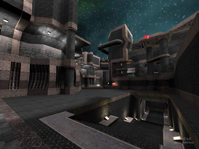
,,Bleach''
,,Bleach'' by MaGiC-WaLKeR
Comments
Add a comment
avatar
**Preview only**
Be sure to submit your comment
Formatting help
Submit
Preview
Cancel
Submitting comment...
avatar
FragTastic Rep. 2459
#15   06 Jan 2012
Amazing looking map.
Agree (0) or Disagree (0)
avatar
HelterSkeleton Rep. 6698
#14   05 Aug 2008
This is a fantastic map! and honestly the more i play on it the more i love it. Yes the teleporter at the plasma gun is a little annoying but you just have to learn to deal with it - and as it turns out being forced through it or inadvertently going into it can really change the outcome of your strategies adding to the suspense. My 1 other gripe would be access to the upper and lower levels from the grenade launcher. the gl is a really decisive weapon on this level because you will need to pick it up quickly to set up your kill shots (especially around the bouncepads and lightning gun pick up as taken from above), as well as to flush out the rail gun after pick up & round the corners as you weave through the external perimeter. As a tourney you can really appreciate how annoying relying on the bounce pad is or taking damage hits from grenade/rocket jumps when picking it up. This appears to be the reason why its painted into a corner. the gl/lg is the next important route after the rl/pg/mh (for suppressing the rail gun or keeping it out of play altogether) and an important combo to have for winning the rg to ra or rg to lg takes. its always handy to have the plasma gun already when you go to pick it up. and the order for pick-ups will depend entirely upon spawns. Hooning it would potentially break this up! But the forced errors around the grenade launcher can be really frustrating... REALLY frustrating!!! All weapons will get used in this game of brachy backwaters and long and winding atriums that function as the necessary but hazardous river crosses and trecherous raftings up and down stream as you keep yourself covered from the crocs and the spear fishers...
Edited: 02 Aug 2010 AEST
Agree (0) or Disagree (0)
ydnar unregistered
#13   15 Jan 2004
T-junctions have nothing to do with bots--or any collision/trace testing, for that matter--they are purely cosmetic.
Agree (0) or Disagree (0)
Myth unregistered
#12   12 Jan 2004
Quote: "Comments about brushwork just arent important."

not entirely true. I definately agree with you that gameplay should be the main focus of a map review but aesthetics are important to a lot of people, not least of all the map designer.

Agree (0) or Disagree (0)
The Hubster unregistered
#11   04 Jan 2004
Cheers Tig, much appreciated. As before, no dig at you of course, justa general thing.

Cheers, Hubs

Agree (0) or Disagree (0)
Tig unregistered
#10   04 Jan 2004
I've put up an editied version of RasputiN's review and removed my lazy effort.

Personally, I think the current layout and openness of the level suits a 2vs2 or 3vs3 Team DM. The RG and RA become a nice control focus for the dominate team.

In a FFA, the openness of the map leads to RG shoot-outs with the best RG player winning the match each time.

Agree (0) or Disagree (0)
The Hubster unregistered
#9   04 Jan 2004
RasputiN: damn good commenting, thats a great description of the map.

Tig: again, I do apologise, but at the end of the day, any map thats had hard work put into it deserves a comprehensive review.

I know I sound biased here, but the only ones reviewing maps properly these days seem to be promode players.

Comments about brushwork just arent important.

//hands on hips

:P

Agree (0) or Disagree (0)
nitin unregistered
#8   03 Jan 2004
scale's too big IMHO. Looks wise, it's interesting brushwork but some of it looks a bit too cluttered, chaotic and messy.
Agree (0) or Disagree (0)
StormShadow unregistered
#7   03 Jan 2004
A little too big for me. Some of the rooms felt a little large, some of the halls were a little long, and the distance between weapons and items was too great, imo.

There are a lot of good points however - the map does flow well, and there are very few dead areas. The architecture and texturing are interesting as well.

7/10

Agree (0) or Disagree (0)
Tig unregistered
#6   03 Jan 2004
The Hubster: Your right. The review reads a little rushed and lacks a serious information about the game play. I'll do an update to the review.

While you wait for the update, I suggest reading RasputiN's comment :]

Agree (0) or Disagree (0)
RasputiN unregistered
#5   03 Jan 2004
I like the looks of the map. The design is very consistent and has some interesting ideas ( pipes for stairs, the jump pads, etc. ).

Layout is the common dual atrium style, which is a good starting point, but the implementation seems to have a few quirks. Distance between both the two atriums and the two sides of an atrium is too much, hence there are too many long-ish corridors and empty rooms ( like the one with GL ). The reciprocal PG teleporter is a major pain in the back. :( Sitting in the corner of a tight corridor, it's very easy to accidentaly slip into, and the teleporter destination there spews you right into the wall. There are pillars to duck behind, but mostly on the upper levels, so the lower ground is sort of a death trap. There are not many ways to get higher from the middle of the atriums : you have a ramp to the RL, but otherwise, you're forced to use the corridors and the jump pads. Which are more or less protected against rail whoring, but are still pretty risky ( and the launch force and direction is somewhat weird ).

Item stack is OK, placement is not. One of the atriums has a RG in plain sight, the other one has the ammo, both easily accessible. Even worse, there's a spawn point right next to RG! ( I guess this answers "Does any weapon dominate?" :P ) YA is in an intersection of tunnels, above a JP. The RA sits high atop the map, accesible only via a jump pad at the end of a long sloping corridor, thus it can be locked down too easily. ( You could actually jump to RA from the uppermost level though, but you'd need weapon assistance or better CQ3 movement than I. ) Another YA or at least a bunch of shards here and there would have been better, especially considering the railfest that's bound to happen. Health is OK, but again, maybe another +50 or a bunch of bubbles would be better.

I did run into two bot bugs: they get stuck before the YA jump pad and on top of the large pentagram on the floor. I have no idea about the first, but the pentagram doesn't feel like it's clipped off properly.

Whew, that's a whole lot of whining there, ey? :D Still, if you're not looking for a competitive map, and just need a rather fresh looking map for a quick FFA, this just might be the ticket. I'm hesitating between 6 and 7, but tending toward the later.

Agree (0) or Disagree (0)
remnent unregistered
#4   03 Jan 2004
one of my favorites from the Tikidomain 2Q3 mappers challenge (of which I came in last -bleh). Long corridors make the gameplay a bit slow, and could use some more weapons. Otherwise, very nice.
Agree (0) or Disagree (0)
The Hubster unregistered
#3   03 Jan 2004
//rolls eyes skyward
Agree (0) or Disagree (0)
not entered unregistered
#2   03 Jan 2004
gameplay?! why's that matter? just 'grab it'!

:-/

Agree (0) or Disagree (0)
The Hubster unregistered
#1   03 Jan 2004
(sorry tig if you wrote this review): No comments on the GAMEPLAY!

Why is this better for 2v2 or 3v3? How do the item stacks work for the map? Does any weapon dominate?

Agree (0) or Disagree (0)
Clear