Added 05 Aug, 2003
Comments
Add a comment
**Preview only**
Be sure to submit your comment
Be sure to submit your comment
Submitting comment...
coughjackasscough
nice map though. 8/10
Agree (0) or Disagree (0)
no no see orange is the whole of the green. obscurity only stiffens the purpose. not without milk leave it alone ask the farmer. how much, never a doubt, no no can the fish just awake?
Agree (0) or Disagree (0)
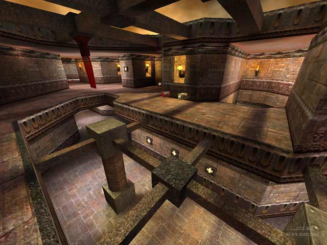
Umm...well, I enjoyed it. I especially like the circular room's idea, though it contains a lot of armor. The high staired room made for interesting firefights, as did the lattice-work atop some of the pillars (see review screenshot). It looks like a nice-enough Q3 Gothic map, which is common, but you couldn't accuse it of having any major visual faux-pas. A fun map if you like FFA. Didn't try tourney.
7/10
-Octovus
Agree (0) or Disagree (0)
