Added 12 Mar, 2003
Comments
Add a comment
**Preview only**
Be sure to submit your comment
Be sure to submit your comment
Submitting comment...
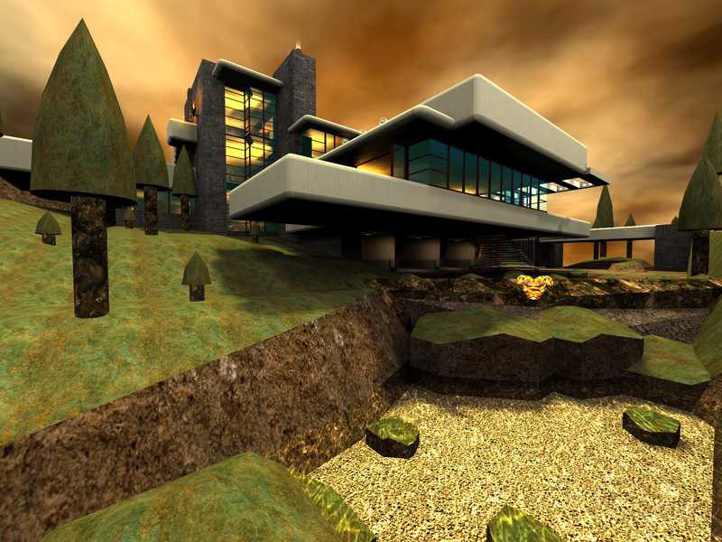
This looks similar to a map i played in CS:GO, nice map architecture and visuals.
Agree (1) or Disagree (0)
While maps like this one are more about visuals than gameplay, I still think its neat to be able to see what something looks like in the Quake III engine, regardless of its playability function.
I'm still waiting for someone to make Freddy Fazbear's Pizzaeria in Quake III because FNAF used those classic 90's pre-rendered graphics, despite the original game being released in 2014.
Agree (1) or Disagree (0)
Frank Lloyd Wright, a student of Robert Sullivan, who is considered America's first modern architect, adopted his belief that "...form ever follows function". Because Mr. Wright did not design this innovative and masterful edifice for use as a Quake 3 arena, one may well understand why it may not be so conducive to game play. Aesthetically enthralling, as a reflection of the original, though it may be, its use may therefore be limited to solely one of novelty. Although more effort could have been expended making the outer perimeter appear more finished, it should be stated that the body of the map shows much care and consideration to intricacies, making it a thing of magnificence.
Agree (2) or Disagree (0)
Very neat display of architecture, the building is one of the classics I very much admire. And I always wondered how exactly the rooms connected. Now I have a "vague" idea.
Alas, the in-door gameplay is almost impossible, the map is too cramped. It would have helped to "scale down the player", i.e. scale up the map, to avoid having so many cramped areas in the map.
Agree (3) or Disagree (0)
An interesting map, with many details. But it's sometimes too narrow to move an fight correctly. You can easily dominate the map by collecting the Quad, Regen and Battle Suit.
Other than these defaults, I like this map.
Other than these defaults, I like this map.
Agree (0) or Disagree (0)
It's so tiny that I can't see a thing. Too futurist, nothing to do with reality
Agree (0) or Disagree (0)
A visually interesting level, with some playability. This could have been a really great level if it wasn't for one thing: The very narrow passages. Listen, 187-J4CK4L, for your next level, make sure all passages are AT LEAST 96 units wide, preferably 128 units (that's 2 of the big squares in the editor). Aside from the narrow passages, the layout was interesting, and gameplay was not too bad.
Agree (0) or Disagree (0)
Dont use this FileCrap, Many people don't, so none of your levels will be downloaded beacuse of that.
Adios !
Agree (0) or Disagree (0)
wIeRd mAp but only really fun in a couple packed ffa's
Agree (0) or Disagree (0)
