**Preview only**
Be sure to submit your comment
The reviewer seems to not have liked this much..
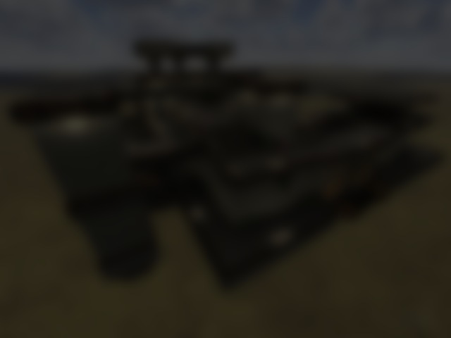
I think it's a pretty fun map. A little unusual for a floater, given how it looks and the "indoors" areas.
Good item placement, though there's a LOT of health. Only one armor (yellow) which I appreciate. Skirmishes all over the place!
Had a good time with this and am very pleased to have found it after all these years.
Agree (2) or Disagree (0)
Very fun to play, specially on fast mode (fraglimit 10, repeat). Hunter will give you a hard time here!
Agree (2) or Disagree (0)
I like the design / texture choice and the way the walkways are draped around the central arena. Obviously such complex space maps have r_speed (FPS) issues, and this is the case in this map as well, but the map is still playable (even on my old hardware). The bots seem to clutter in the central area though. The map might work better in instagib using real players.
Agree (1) or Disagree (0)
Arkanee
unregistered
#9 27 Mar 2003
I would say this map so so fantastic...the map is good with bots and real "enemys"...right Schulz ;) g
Agree (0) or Disagree (0)
Combo
unregistered
#8 22 Mar 2003
this map is cool, it rocks with instagib on. one of the good floaters!
"Schönes Wetter zum railen heut!" "Ja, sieht nach Wolkenbruch aus" :D
Agree (0) or Disagree (0)
Mr.T
unregistered
#7 22 Mar 2003
wow, this map is pretty good. yeah of course the light could be a bit better, but it´s ok!
And the name of the map is pretty good too i think!
i only can say: good work schulz :)
Agree (0) or Disagree (0)
Schulz-VR
unregistered
#6 20 Mar 2003
mh...most of the people say the light is too dark inside :-/ i dont have seen it with my configuration, sry, i am very sorry :(
@kell
the webmaster has changed something, i would say... try <a href="www.chaosquake.de/index.php" Target="_BLANK">www.chaosquake.de</a>
Agree (0) or Disagree (0)
Kell
unregistered
#5 19 Mar 2003
Addendum: the download for Bloodybunny on your site doesn't work. Have you withdrawn it from release? Because I'd like to try it out.
Agree (0) or Disagree (0)
Kell
unregistered
#4 19 Mar 2003
This is a very neatly structured map, if a bit on the blocky side. The three huge anlged supports are my favorite features - very cool. It straddles the line between indoor and spacemap rather well. Having played this and looked at some of your other maps, I'd say you have a good grasp on how to use concrete architecture with foliage and realsitic daylight; I'd strongly recommend you try mapping for a Q3 engine realism game or mod.
The interior -is- short of illumination; having a division between indoor and outdoor is good but you have to light the interior with electric while the exterior is flooded with all that bright sunlight.
Still a well built map, if not the most outlandish of the space genre.
Good use of the skybox, btw :)
Agree (0) or Disagree (0)
Wilhelm Hell
unregistered
#3 17 Mar 2003
If you do, let me know.
Agree (0) or Disagree (0)
Schulz-VR
unregistered
#2 17 Mar 2003
thx 4 playin :)
u r right, the lightning is a little bit bad. maybe i droped this map to early :-/ if i have enough time, i will change it, maybe...
Agree (0) or Disagree (0)
Wilhelm Hell
unregistered
#1 15 Mar 2003
Wolkenbruch looks good and it has a nice flow to it. Quite a few interesting spaces both for gameplay and to the eye. I had fun playing it and I'll definitely keep it. Item placement could be a little better, though. Maybe less weapons and more armor. If I could, I would replace YA with RA, and put a YA or more here and there. The author could have done something more about the twin bounce pad on the back, also. It looks important but doesn't feel it. The looong bounce to the YA is pretty cool, though.
And I have to agree about the lighting issues in the main inside area: It's waaaay too dark. Really annoyingly dark, actually. But apart from that I think this map was very entertaining most of the time. Good job!
PS: Nearly everything has been done in nearly every theme, v1/3.
Agree (0) or Disagree (0)

