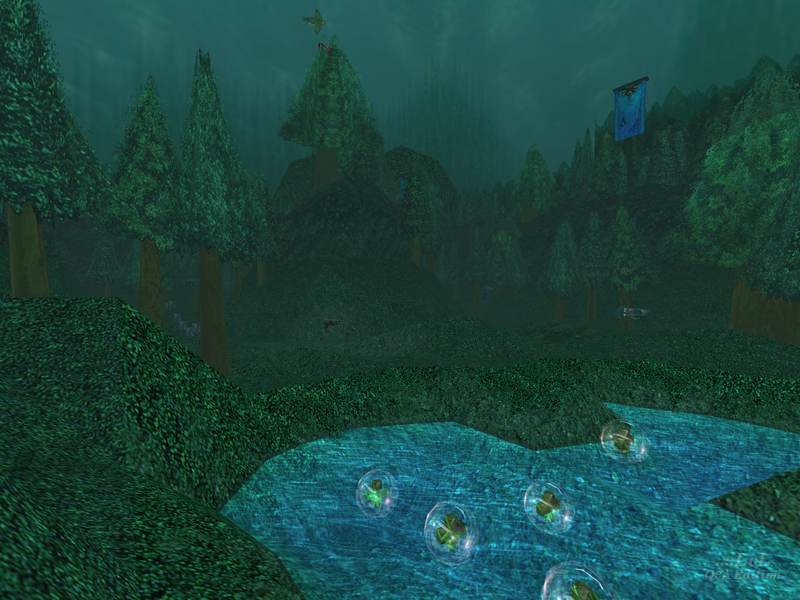
LDAQ3A05CTF
LDAQ3A05CTF by Lee David Ash
Comments
Add a comment
avatar
**Preview only**
Be sure to submit your comment
Formatting help
Submit
Preview
Cancel
Submitting comment...
avatar
JoeBeamer Rep. 116
#8   21 Jun 2019
never seen a map quite like this, no bot file, but can't help but vote a 5 for it, because it has received some bad votes I think.
Edited 28 seconds after the original posting.
Agree (1) or Disagree (0)
Anonymous unregistered
#7   28 Mar 2016
Cool man i like map that a lot of tree but quake 3 rarely has map like this i give 5 star then
Agree (0) or Disagree (0)
avatar
FragTastic Rep. 2459
#6   06 Feb 2012
I love Rain themed maps :). it's just a nice calm atmosphere but when the Rocket is launched in the air, Havoc begins and wreckage is formed :). 10/10
Agree (0) or Disagree (0)
hk2244 unregistered
#5   07 Jan 2011
Nice map but the caves could be more longer. And it needs more atmosfere :D Good map aswell.
Agree (0) or Disagree (0)
$$ unregistered
#4   19 Dec 2010
This map is one of those Organic maps like Decidia. Why is it there were only like 2 comments the year the map was introduced?! This map is great!
Agree (0) or Disagree (0)
SW12 unregistered
#3   03 May 2010
In a way this map reminded me of both Decidia and Ripper's Playground. I thought this would look cool. Only problem is the missing water textures. Other than that it's great.
Agree (0) or Disagree (0)
Shallow[BAP] unregistered
#2   01 Dec 2002
I downloaded this map to review a couple of weeks back but never got around to it, mainly because it was difficult to decide what to say. On the one hand, it's certainly a bold subject to try and tackle and has been carried through, obviously with a considerable amount of effort from the author. On the other, there are many places where you can point and say, "This could easily be done better". I think at least part of the map might have been better done as a terrain mesh (with a much finer grid of tris than you would normally see) which would eliminate the ugly joins visible on many (most?) edges where triangles join. Other parts of the structure could probably look just as good done with chunkier brushes, saving a lot of tris. The trees are quite cool given how simple their geometry actually is, although some have planes intersecting in such a way that you get a weird Rorshach-blot mirroring effect.

As far as playability goes, you navigate the middle section by sense of touch because of flat lighting and featureless textures (colour variation in the textures and visible features like torches or mushrooms or something are badly needed here), and as Tetzlaff mentioned the floor is completely uneven throughout the map which makes the simple act of walking around a trial and aiming on the move practically impossible.

Overall, not a very good map, by no means terrible but just not good. Only download it if you want a looksee because it does look quite nice in parts.

Agree (0) or Disagree (1)
Tetzlaff unregistered
#1   01 Dec 2002
Great map?! Sorry, but I think it´s actually quite bad. It´s almost completely horizontal, it´s cramped and you can barely move because of the busy brushwork on the ground, lighting is dull and there is no ambient sound to bring the forest athmosphere to life.

The swaying tree branches are a nice touch, but that´s about it. The terrain would have looked better (and maybe provieded smoother flow) if brush sculptored rocks would have been combined with a smooth terrain mesh.

It´s a typical LDA map: cool ideas and an interesting vision of the map, but poorely executed and no gameplay at all.

Agree (1) or Disagree (1)
Clear