Menu..::LvLForumExploreSearchProfile avatar

The Bad Place (3)
Mink

Added: 1 Oct 2002
Write a comment
Bold
Italics
Small
More...
Preview only
FragTastic
10 Jan 2012 #6
Its your first map and i can tell you put a lot of hard work into this map. Its ok for your first map but just keep practicing..
Reaction ~ Reply ~ Report
.
26 Dec 2010 #5
No I don't like this map, the textures are horrible when I played this map in Generations. the good place is much better
Edit ~ Delete
Woolie Wool
27 Oct 2003 #4
It needs to be bluer. DM4 was mostly in that bluish scheme that was my favorite in Quake.
Edit ~ Delete
Tetzlaff
4 Oct 2002 #3
Well if it´s your first map, it´s not bad. And yes, the size works well with the Q3 physics, some older dm4 remakes were too cramped (but Powzer´s Remake for example has also good scaling)

You misunderstood my comment with the floors, I mean they look too thin when you look from the side (not from topview).

You need better beta testers ;)

Edit ~ Delete
SpAwN
4 Oct 2002 #2
The floors are too thin? In the original you were lucky to get 2 people side by side on those floors. The proportions should be a bigger than the original, and that's what I was going for. As much as I loved the original, I always felt it was too small(I also felt this way about the remakes I've played... although their remakes look about 10x better, heh).

And yes, the architecture does look plain. I will admit that... this is, after all, my first map; It will also be my last. Anyway, I won't expand on my feelings about curves and fancy map objects because that'll just lead to a bunch of rants. :)

To finish this already long post, I'd actually prefer criticism. My map testers showed none, so I couldn't really do anything to make it better. I just went by how I felt and what I thought needed fixing. :)

Edit ~ Delete
Tetzlaff
4 Oct 2002 #1
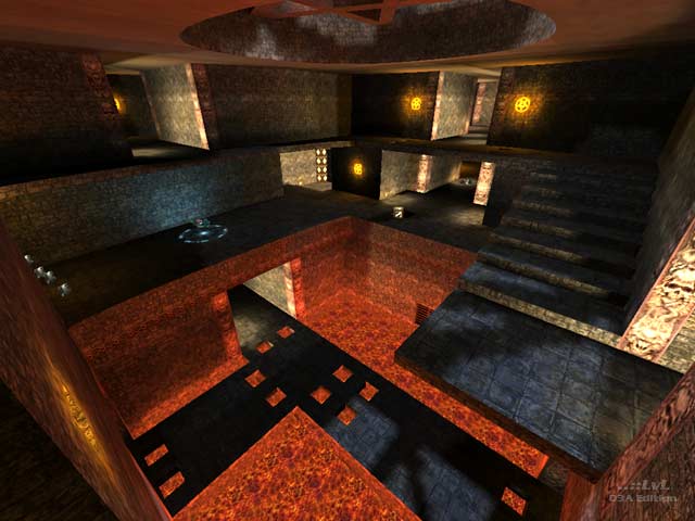
In my opinion it neither looks or feels like the original. The architecture doesn´t look solid and has very different proportions than the architecture in the original (look at the door´s shape for example, or the shape of the atrium), floors are too thin and the stair is sloppily constructed etc. It also doesn´t makes a big use of the Q3 features, there is a curve here and there, but overall the architecture looks very plain.

Unlike the original, there is a complete lack of ambient sounds (sounds have a great deja vu factor).

Texturing is quite nice, it doesn´t have that blue-ish Bad Place look but it´s ok.

Sorry for the harsh words, but it doesn´t shine because there are a number of better remakes out there.

Edit ~ Delete
Theme:
Bots:
Textures:
Not set
Comments:
6 comments (14.73 yrs ago)
Ranked:
Downloads:
2,730 & 399 LiveViews (daily avg. 0.36)
File:
q1dm4v2.zip, 767.23 KiB
PK3 date:
7 Aug 2002
..::LvL ID:
NewerOlder

Map history:
Clear
    ..::LvLExplore
    Search history
      ..::LvL Markdown
      The following syntax can be used to format comments.
      Close

      Loading...

      Map Search

      Search for a map.

      Results will appear here.

      Map peak