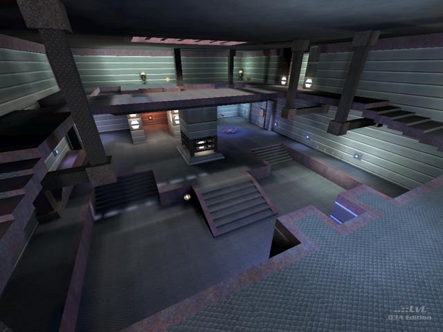
A low detail tech themed map with bad bot play. Its mostly chrome textures and some sparse, unclipped detail work in the standard id base theme. For the most part, the layout of the map is pretty good, and there is lots of connectivity. However, misaligned textures, a few dead-end areas, and lots of pointless ledges and walkways, make it feel like this level is incomplete. The bots try, but quickly gravitate to the Quad room and then hang out without actually grabbing the Quad. Bots gets confused by the vertical only jumppad correctly, they just bounce up and down.
Low-detailed map for human play only.
Reviewed by amethyst7.
Second Opinion
This appears to be the authors first release.It's a medium sized, tech themed map, with three main areas and two floors. Bots get confused on the middle areas jump pad, and sometimes just keep trying and taking damage each time they hit the ground. Other than that bots navigate most of the level fine, but don't go for the Battle Suit or MegaHealth. The textures start to seem a little overused, but the use of shaders makes for a little eye-candy. Some of the lighting is off, but hardly noticeable. Item placement is not too bad, but it could be better with a RG. All and all this is not a bad first map, good connectivity, and game play, just needs the aesthetics tweaked a bit.
Its not a very big download, so go ahead. You can always delete it.
Reviewed by MajorDick
Ranked: 3.7 out of 5 (5 votes)
Download: Deep blue by VIAGRAA
