JonnYReds has made a lot of awesome maps that we play in our family's rotation, but I feel this one misses the mark. It is designed for FFA and tournament and both are a good fit. I suggest no more than 6 players, but that number feels about right to me. I have played with 5 bots and they seemed to play fine. I really like the visual style of the map, it is a small-medium sized map.
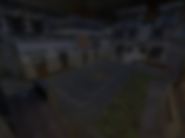
There were a few problems for me that really stood out like a sore thumb. First, there are some z-fighting points. While there is not a huge amount of it, I found myself passing it repeatedly as it is by one of the angled platforms on one end of the map, in the courtyard, where the majority of the fighting happens. This resulted in me seeing it all the time.
Secondly, the use of low-res textures literally started giving me headaches and getting nausea, especially by where the jump pads are. This is definitely a case where a higher resolution texture should have been used and this same issue occurs in most places on this map.
Third, the use of the skull texture is fine and looks nice, with it looking 3d-ish as the textures make it look like the skulls have a lot of emphasis, but it is not a seamless tile and are used in every area, in big giant sections. This results in seeing really noticeable seams from the edges of the texture. This could have likely been fixed or a different texture used. I know there are plenty of tile-able skulls out there, I've seen a variety in dozens/hundreds of maps. It is really jarring to see the top, bottom, and side seams when it is tiled for a long distance.
The next complaint I have about this map is the lighting. To me it seems overly bright, almost to the point of hurting my eyes. I realize I can adjust the brightness in the game itself, but for most other maps my settings are fine, this one is just really bright. That should be toned down a bit even though it is outside.
Finally, the jump pads and launchpads, while cool looking, look really out of place here. Again, I'm all for bright colors, but maybe the saturation needs to be toned down a bit, as the contrast between them and the rest of the level makes them seem very out of place, and in my opinion, they just do not fit well with the visual style and design of the map.
The map layout is fun, I enjoyed it, but it is not worth keeping until these issues are fixed, in my opinion, 2/5 from me. I played on OpenArena, your mileage may vary.
Reviewed by Mapsking
Tigs note: There is a possible lighttmap issue with this map. The screenshots were all taken with cl_render opengl1. Under opengl2, the results were blown out or washed out. r_hdr 1 helped, but the constant re-balancing become unbearable and produced uneven screenshots.
Ranked: 1.8 out of 5 (6 votes)
Download: The Ghost Contea by JonnYReds