**Preview only**
Be sure to submit your comment
Jason "Wolfen" Spencer
unregistered
#10 19 Mar 2000
Thanks for all the feedback guys. I stumbled on this site and it looks cool.
Just for the record. This map was made in literally 5 days. I did not want this map released becuase I was never happy with it.
Im currently doing a new map for S3 which is a CTF level. You can view some screenshots at www.qeradiant.com/stuff/0000.jpg
www.qeradiant.com/stuff/0001.jpg
www.qeradiant.com/stuff/0002.jpg
www.qeradiant.com/stuff/0003.jpg
Feed back on the shots is fine, drop me an email at wolfen@qeradiant.com
The reason those maps did not work with out a S2k is becuase they were specially designed to work with our chipsets to show off the features of the savage2000.
Thanks again guys. Until next time. CYA!
Agree (0) or Disagree (0)
Gila
unregistered
#9 11 Feb 2000
Maps are great, excellent hard work and etc. But releasing them only for S3 Video cards was lame! Also, they are huge not only in game size, but lotsa Mb. But they look cool and unusual. Also I hate "Savage 2000" everywhere!
Agree (0) or Disagree (0)
Senn
unregistered
#8 09 Feb 2000
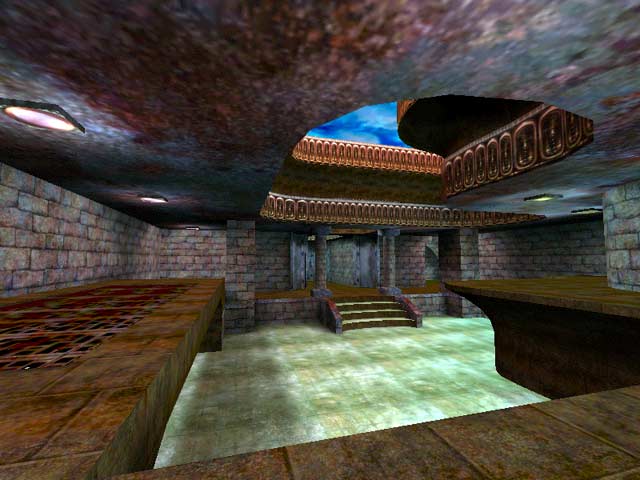
Wow... i was expecting a lot more from these S3 maps. There are a lot of buggy lights (mostly due to overlaping brushes and not carving them into the walls) and some bad texture alignment. The stair height also looks humongous compared to the standard 8 unit Q3 stair height. The problems are not just limited to this map, they occur in nearly all of the S3 maps.
Some of the architecture is very plain and the one "tech" styled jump pad is WAY out of place in the medieval/rusted castle theme.
I agree with the rest of the guys, this level is very 2 dimensional. It seemed as if most of the detail work went into the ceilings and collumns instead of the actual play area.
Overall, not a bad map, but i expected a HELL of a lot more from these guys.
Agree (0) or Disagree (0)
Tigger-oN
unregistered
#7 09 Feb 2000
If there is a different, better textured version (thats not .dds format) plz let me know where i can get it from, and i'll update the file (and screen shot)
Agree (0) or Disagree (0)
AssBall
unregistered
#6 09 Feb 2000
This is a decent averge map. I agree it is a little 2d. The textures do seem a bit blah too. It runs very well though, and I thought the general layout was great. I found it fun with as few as 3 people total on it. The reailgun is nice for the lengthy rooms. Definately one of the better custom maps out there.
Agree (0) or Disagree (0)
Redrum
unregistered
#5 09 Feb 2000
Damn I can't spell or write more than 2 words without making a mistake! I gotta stop playing this game...
Agree (0) or Disagree (0)
Redrum
unregistered
#4 09 Feb 2000
Could be me but the version I've got has very bland textures and lighting even though I got from the sam source. Looks nothing like the screen shot above. The rest of these maps seem ok, just this one thats funny.
Anyone else have this feeling?
Game flow is ok we played a 12 player match to really fill it up. The strange combination of square corridors and sweeping curved corriders didn't seem to work so well.
Item placement allso seem ok with 12 players you have to really turn down the respan time to give everone a fair chance. Wiht less than 12 we found it take a while before you get your weapon of choice (whatever that may be).
We also found a bit 2 dimensional (at least in comparison to some of the other maps in this pack).
On the whole Wolfen did a good job I just wish I could really see it in all it's glory...
Agree (0) or Disagree (0)
RocketFodder
unregistered
#3 09 Feb 2000
Map seems like it would be fun to play with up to 6 people, useless placement of the machinegun, but otherwise a decent map. I'm sure the larger version looks much better.
Agree (0) or Disagree (0)
RedFive
unregistered
#2 09 Feb 2000
Man, these new maps are HUGE !!! I guess a 56k modem just doesn't cut it anymore. When will we get T1 for 5$ a month (I can dream, right?) ???
Agree (0) or Disagree (0)
smeghead
unregistered
#1 09 Feb 2000
Making comments on all these maps..
Found this one to be okay, but I expected a bit more of a professional polish to it. I haven't seen a whole lot of Wolfen's maps, so I don't know how it compares to the others.
Agree (0) or Disagree (0)

