**Preview only**
Be sure to submit your comment
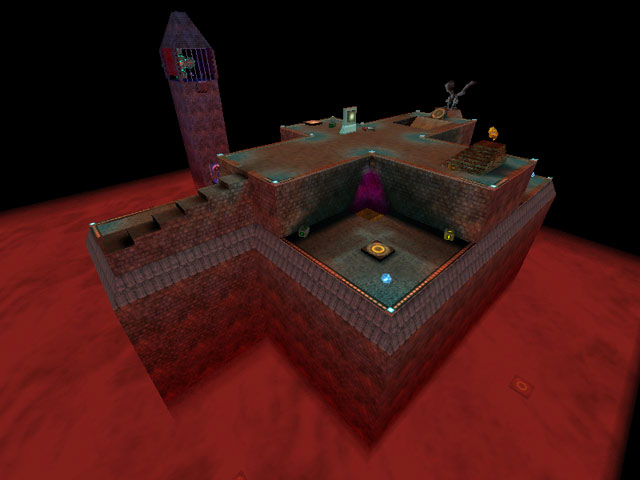
the bounce pads in the red fog were a nice touch. I would have liked to have seen a few more of these strategically placed.
Agree (1) or Disagree (0)
Zebraing, raising r_znear will resolve this, but r_znear is cheat protected.
Agree (0) or Disagree (0)
It's your first map, I cant blame ya. It's a good try but keep on trying
Agree (0) or Disagree (0)
Instead of just black, you could have used the skybox that has the swirling red and black clouds to make it look as if this took place on Jupiter or something.
When I get into making a map, I'll make one that your fighting on a Gas Giant planet on some Gas Mine or whatever. Unless someone else can do that for me.
The map was fun. But I found myself playing it with the Hunt mod seeing I liked it better doing that than just on vanilla Quake 3. This map deserves....4.5
Agree (0) or Disagree (0)
antimatter
unregistered
#24 09 Jan 2001
The BFG trap is quite intuitive, but overall this is a simple map, but one that is good for a 4 person ffa
Agree (0) or Disagree (0)
Heaven
unregistered
#23 29 Apr 2000
I cant vote.It saysOur records show that a score from the ip number - 195.29.253.76 - has been placed already this week for this map, sorry.
Please come back later to rank this level again.
If you believe this information is incorrect, get in touch with tigger@ebom.org and state the following:
the map number - 252
your ip number - 195.29.253.76
the ranking you wanted to give this map - 6
and that it was for LvL - Q3A edition
From there, Tigger-oN can check the records, and make any adjustments that are needed.
Agree (0) or Disagree (0)
Destroy
unregistered
#22 28 Apr 2000
oh, yeah. I agree. I went overboard with the colored lighting.
Agree (0) or Disagree (0)
Destroy
unregistered
#21 28 Apr 2000
Thanks Heaven. I guess I should have put more thought into arena file (that file controls how many bots go in the level and which game modes the level is available in). But even if there are too many bots, you can remove them at the console.
By the way, Ray. There are 3 hidden/obscured jumppads in the fog that will send you back to the top of the level. They are your last hope if you don't have the personal teleporter. It doesn't happen often but sometimes they save my ass.
If you're feeling gutsy/stupid/courageous or all of the above you can intentionally use those jumppads to surprise people and maybe score a kill because of the higher approach. If I did those kind of random jump pads again, though, I would make them bigger or more frequent.
Agree (0) or Disagree (0)
Heaven
unregistered
#20 27 Apr 2000
Ray is very bad,he dont know nothing.The map is good ,but there is something in that ' Too colorfur 'and' you put too many bots.Igive it 6.
Agree (0) or Disagree (0)
Ray
unregistered
#19 27 Apr 2000
This map is bad. Too colorful, you put too many bots and there's something weird about that fog. I jump in it and I hear IMPRESSIVE and it puts me back on the top of the level. That happened only once. This map's gameplay is so bad I give it a 1 and graphics is too colorful and on places so ugly I give it a 3. That's 2. :)
Agree (0) or Disagree (0)
Destroy
unregistered
#18 22 Apr 2000
That's fine. Yea, I imagine that would be hard to remember when you're looking at probably 20 maps a day.
Agree (0) or Disagree (0)
Tigger-oN
unregistered
#17 22 Apr 2000
Destroy - I've looked at a lot of maps and I got the teleporter/portal wrong, sorry (i was going from memory, its hard to remeber the details of every map I've looked :])
Agree (0) or Disagree (0)
Rokscott
unregistered
#16 21 Apr 2000
Saw the screenshot, went back to the map. Found the place... and still no
zebra effect !
Used "r_showtris 1" and could see there was possibly an overlapping brush but there was no indication of this othewise.
What a hassle this is (the variations in video cards I mean).
It would seem that if you want to edit seriously for Q3 you need 2 systems, One with a VooDoo, and the other with a proper open GL card.
Agree (0) or Disagree (0)
Destroy
unregistered
#15 21 Apr 2000
So there's the bug. (by the way, that's not a teleporter, that's just a "security camera" looking on at the bfg tower)
I spent a lot of time removing zebra bugs and might not have seen that one because of the green light. I'll still have to check it out for myself (and maybe revise later on). Clocktower had about 50 revisions with at least 30 of them because of refining the tower for bots. When I first made the level (before the clocktower was there), the level had neat gameplay aspects because of the rocket launcher area basically being a "king of the hill" area. I might make a version of the level without the tower (although it would need a totally new name then).
Yes, this is my first quake3 map.
Please check out my other quake3 level, lupohse3, available from:
www.dclink.com/destroy
Lupohse3 is based on my house. It's cramped but it's unique. There are, bedrooms, kitchens, bathrooms, toilets, water pipes (big enough to walk through), custom sounds (such as homer), lots of doors, custom textures straight from my digital photos of my house, and other goodies. It also features the ctf mode of play. In ctf it poses the question of "balanced yet imbalanced?"
As for clocktower having too many bots, maybe you should try removing some for a 3 or 4 player match. (I probably went a little bot happy for the default bots)
Agree (0) or Disagree (0)
Tigger-oN
unregistered
#14 21 Apr 2000
for all the non-believes of the overlapping brushes bug (the zebra effect) check out;
lvlworld.com/level...locktwr_bug.jpg
this bug is easy to fix and to prevent if you know why happens and if you know what you are doing. bascially don't over lap brushes :]
Agree (0) or Disagree (0)
Jim
unregistered
#13 19 Apr 2000
I don't think I've seen a map that makes getting the BFG such a high risk- I did like that feature- but I think this map lacks in the texturing department. Layout could be a bit better too- maybe take out the fog at the bottom too and just make it a space map- or surround it with walls and sky instead- heck- afterall it is a box map.
Agree (0) or Disagree (0)
CoReUpPeD
unregistered
#12 19 Apr 2000
Hey tigger Dude I got a tnt2 card and I dont see one Zebra thingy. Maybe its time for you to update your drivers or get a new card man its just a little bit of aliasing dude.
Agree (0) or Disagree (0)
SiCdeth
unregistered
#11 19 Apr 2000
tigger, i have a tnt2 card and i didnt notice any weird zebra effects at all, nor do i in any of the other maps that u claim to have such effects
Agree (0) or Disagree (0)
Tigger-oN
unregistered
#10 18 Apr 2000
The zebra effect is inside near the teleporter. It shows up very prominently on TNT2 cards
Agree (0) or Disagree (0)
SiCdeth
unregistered
#9 18 Apr 2000
oh yeh, um, i didnt mean that the bfg area was too cramped, i was talking about the whole map in general
Agree (0) or Disagree (0)
SiCdeth
unregistered
#8 18 Apr 2000
it wasnt too bad, well actually yeh it was, but there were some cool elements, like the hidden bounce pads under the hellfog at certain points, i liked the bfg area. way too cramped though, and btw i didnt see any zebra effects either, oh well.
(4)
Agree (0) or Disagree (0)
Rokscott
unregistered
#7 18 Apr 2000
Er, yeah mandog. I know what a
zebra effect is and what causes it, but I couldn't find any in this map. That was what I was commenting on.
HEY HEY. I've just noticed your scores gone up a bit. Could it be fucker voted 10 ?
Agree (0) or Disagree (0)
mandog
unregistered
#6 18 Apr 2000
zebra effects are generaly caused by overlapping brushes or not having caulk behind curves. When you move past the surface you get diagonal lines which flicker on and off where the surfaces overlap.
Agree (0) or Disagree (0)
Rokscott
unregistered
#5 18 Apr 2000
For a first map its OK. I think most people who start level editing have to go through the "disco light" phase.
The tower itself is quite cool and I couldn't find any zebra effects on brushes either.
4/10
Agree (0) or Disagree (0)
OO7MIKE
unregistered
#4 18 Apr 2000
Have you ever wanted to be in a box with 15 bots all cramped together in a chaotic mess? Sound messy? Well this is pretty close. It was tight, cramped and pretty hairy. This map would be better as a tourney. Its nuts inside and chaotic inside. The author put to many bots in there. (well for stratagy anyways) This map reminded me of "The peak Monastery" The most insane map for Unreal Tournament. Both maps felt like a roller coaster.
7/10 Too cramped, but what a ride!
Agree (0) or Disagree (0)
}h3r!k0
unregistered
#3 18 Apr 2000
sorry about the minor cussing but i did spend time dloading this... is this your first map?
if it is i take everything back
Agree (0) or Disagree (0)
}h3r!k0
unregistered
#2 18 Apr 2000
yes... what a goood map my first attempt was pretty lame <fnfdm1> but this is lamer still i lke the bfg trap and i think that the tower isn't too badly designed... nice design, poor gameplay
Agree (0) or Disagree (0)
Destroy
unregistered
#1 18 Apr 2000
I didn't notice any wierd brush effect. What is the definition of the "zebra" effect. Email me at destroy89@hotmail.com if you know or if you have any comments...
Agree (0) or Disagree (0)

