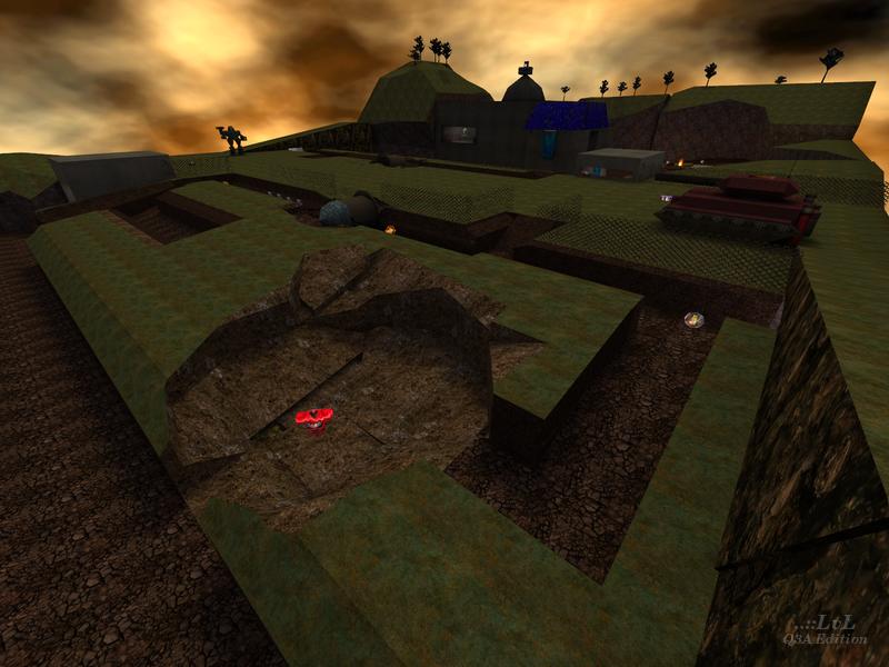
The Death Strip
The Death Strip by KommissarReb (SW12)
Comments
Add a comment
avatar
**Preview only**
Be sure to submit your comment
Formatting help
Submit
Preview
Cancel
Submitting comment...
avatar
HelterSkeleton Rep. 6698
#5   11 Aug 2019
@KommissarReb Ultimately, do what you feel passionate about and what suits the level design. But I reckon the Babylon 5 idea sounds really cool and something a bit different from a Doom 3 Redux
Agree (2) or Disagree (0)
avatar
KommissarReb (SW12) Rep. 2488
#4   05 Aug 2019
I'm glad it gives off Quake 2 and Wolfenstein vibes, because that's exactly what I was going for! I like playing my map in Generations Arena (see this video I made www.youtube.com/watch ) partly because the +25 health on the commander's desks turns into a plate of food when playing as the Earth Soldiers.

The barrier troops that shoot you whenever you go for either BFG can be considered a BFG trap hazard comparable to M. Kupfer's QuArea 51 or Q3DM6. You may notice that their dialogue is different depending on what team you're on.

You aren't really supposed to go up the vent with the health, as it's meant for players on the roof to go down after rocket jumping on the top. Originally I didn't intend to make it one-way, but then decided to leave it like that to add mystery to the level.

Looking back I realize the hallways and rooms were a bit bland. I probably should have made them look (and work) better by making them bigger and more detailed. I had a lot of other people's Quake 3 and Jedi Outcast/Academy experimental maps in mind when I made them, which sometimes also suffer from poor or lazy construction. Next time I will try to set higher standards for myself.

Right now I'm working on a Titan moonbase map. I was thinking about making the corridors like Babylon 5's hallways www.youtube.com/watch . What do you think of that idea? Or should I make the corridors more Doom 3 like?

Agree (1) or Disagree (0)
avatar
HelterSkeleton Rep. 6698
#3   25 Jul 2019
I don't play the mod it was designed for, so I can't really comment about that but it had a real Quake 2 and Wolfenstein vibe going on. The upper areas are all still accessible in Quake 3 with rocket or BFG jumps but there wasn't really all that much to go for, rocket jumping up the side of the wall to grab the BFG is useful though. Really like the upper ceiling cavity and vent areas but I struggled to get in the vent with the health (I didn't actually get in there). The lego-style skeleton soldiers that fire at you when you go for the BFG were really cool. Overall it worked really well, the pokey corridors and rooms in the bases would be the only thing I'd really change.
Agree (2) or Disagree (0)
avatar
Martinus Rep. 662
#2   24 Jul 2019
Absolutely good for a very first map. It has good ideas an theme.

Keep learning about the details of mapping (shaders, VIS, custom textures, etc...)
I'm looking forward for your next map!

Agree (4) or Disagree (0)
avatar
KommissarReb (SW12) Rep. 2488
#1   23 Jul 2019
Thanks gooball for reviewing my map! When making the interior of the bases I went for a "realistic" door size in case I would use my map for machinimas. I wasn't thinking practically, and probably should have thought more about how it would bite me in the back later.

I forgot to add a player count suggestion. I typically play this map with the maximum amount of bots possible, and had fun playtesting it with my brother who loves to use the control room buttons. The map didn't work in FFA, TDM, or Tourney due to a lack of DM spawns, and I couldn't seem to add DM spawns without having players in CTF spawn outside their sides of the map. So I made the map CTF only.

I feel somewhat confident about my map as I frequently play it for fun. I'd be hesitant to release a map if even I didn't like it (though I understand everyone likes different things).

Agree (2) or Disagree (0)
Clear