Added 19 Aug, 2011
Comments
Add a comment
**Preview only**
Be sure to submit your comment
Be sure to submit your comment
Submitting comment...
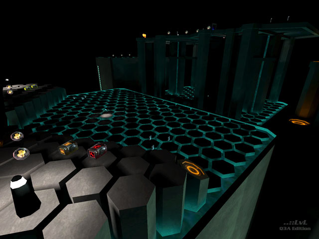
Nice visuals, decent gameplay. But it lacks that something which take fun to the ultimate level...
Agree (1) or Disagree (0)
I actually really like the lighting and style of this map. Not much gameplay value though. Would love a really good map with this same style.
Agree (1) or Disagree (0)
Hmm.. The map to me wasn't interesting but i like the idea of the honeycomb flooring/platforms.
Agree (0) or Disagree (0)
looks cool. kind of like tron themed.
Agree (0) or Disagree (0)
Lol it reminds me a muddle between some of my maps and charon ones cause of the floor celling. :)
I won't compile that map for anything in the world cause of light calculation, that would be a |3itch ^^
excellent job :)
I won't compile that map for anything in the world cause of light calculation, that would be a |3itch ^^
excellent job :)
Agree (0) or Disagree (0)
I think that the floor cells is an interesting idea, mapper should take a look for curiosity and ideas. But there is no gameplay value in it. Looks more like a test chamber. Also making a skybox out of black only without too much light in the room is a very bad idea. At least you could take a space sky to keep it dark and at the same time adding more ambient light to the room. I guess that fragging in there after more than 10 minutes, your eyes will start to get tired because of the skybox.
Agree (0) or Disagree (0)
I agree with TheMuffinMan, with more imagination and effort this map could have been much better. The concept is interesting, I like the lamps.
Edited: 22 Aug 2011 AEST
Edited: 22 Aug 2011 AEST
Agree (1) or Disagree (0)
I almost reviewed this map, before I saw how mediocre it was. Nice details though.
Agree (0) or Disagree (1)
A let-down from Stijns previous offerings. The honeycomb design is nice but the gameplay doesnt have much to offer that is different from your typcial space map.
Agree (0) or Disagree (0)
The honeycomb/hexagonal cell idea is an interesting concept to build around, but the map really doesn't offer anything worthwhile.
With more imagination and effort it could have been much better. As it stands it feels like nothing more than a concept map 5/10
Agree (1) or Disagree (0)
I think the review is a bit unfair and shallow when the only thing noted about the looks is "the lighting is bad". It's obvious that the map author was going for a gloomy cyberspace tech style and experimented with the lighting. The hexagonal pillars being lit by the slime actually looks interesting.
Agree (3) or Disagree (0)
