Added 27 Feb, 2010
Comments
Add a comment
**Preview only**
Be sure to submit your comment
Be sure to submit your comment
Submitting comment...
Great map, we love it in VR. The clean look is superp
Agree (0) or Disagree (0)
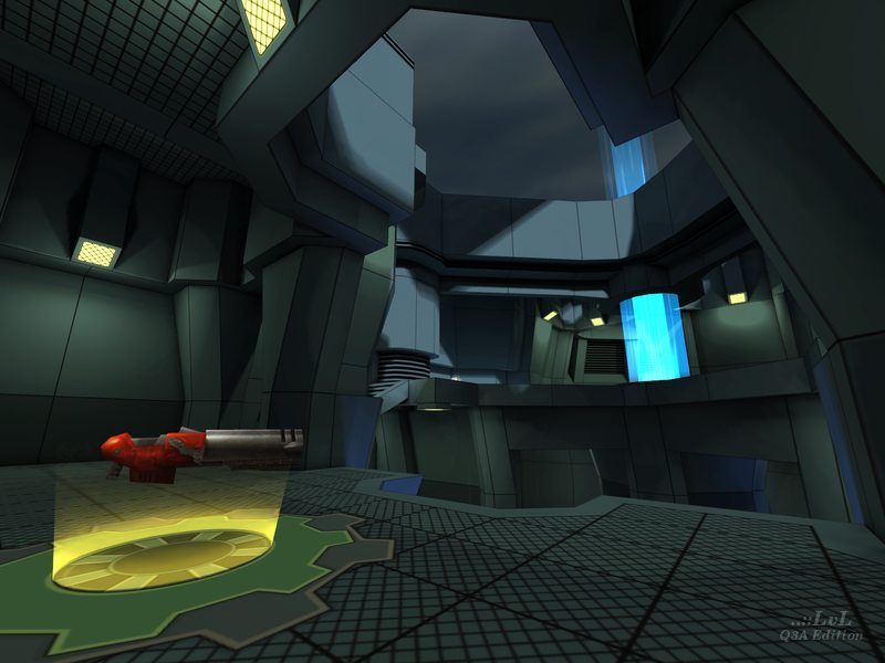
Wow, what a nice looking map. Textures have a cool "cartoon" effect. Item placement decoration is well achieved too (as seen in picture). Gameplay is quite decent but far from addictive. It's too horizontal imo.
Agree (1) or Disagree (0)
certainly is a map for those who appreciate well executed good idea and cool atmosphere. 9/10
Agree (2) or Disagree (0)
Great map. I got the opportunity to play this against human opponents in QUAKE LIVE, and it was pretty fun. I wish the performance were better, as it is a bit laggy (especially around the power tube room) and the clipping could use refinement, but it`s pretty good overall and a worthy addition to the QL map pool.
Agree (1) or Disagree (0)
I just love this map, sock. The sky is truly brilliant, and the ability of the map to maintain complexity with the simplest of textures is amazing. I'm happy to see that you can fabricate such artistic and creative masterpieces as it revitalizes my will to map. The continuation of such brilliance will only bring more satisfaction to the community, and for that I applaud you. Well done, yet again.
Agree (1) or Disagree (0)
This is not the competition version, it is different. I am glad v1|3 did not mention the competition in the review, there is no need. fKd I too was surprised by the results and I certainly see the art of statistics in a new light! The map was designed in three weeks from an experiment to do with portal skies. Full details of how this map was made and the version differences can be found on my website.
Agree (1) or Disagree (0)
I was going to put it in the review that the map was in the Competition, but I didn't want to give the idea that the map was made for it. I would have put it in if it had won the competition of course. Everyone has their own opinion on who should have won, but there were some good maps in it definitely.
Sorry about the cell shaded effects mistake, Tig has it right in what I was thinking I guess... I just worded it wrong now that I notice. =/ The only cell style map I've ever really gave the time of day is cpm28(acid3dm7), and I only like it because it' s a CPMA Mappack map.
I like every map Sock has made though, so it doesn't surprise that I like this map.
Edited: 02 Mar 2010 AEST
Agree (1) or Disagree (0)
still surprised with the results of that comp... great map as always mr sock :D
Agree (1) or Disagree (0)
Thanks for the review v1|3, I am glad you liked the look because you have mentioned to me before you were not a huge fan of cell shading styled maps. The map layout changes depending on what gametype you select and I have included item layout diagrams on my site ( www.simonoc.com/pa...ps_q3/focal.htm ) which show where everything is located. The map is not technically cell shaded but instead the textures have a heavy black line to accent the geometry edges. This was done for performance reasons so that the map 'looks' cell shaded and is good for low end machines. All weapons are included except the Railgun and BFG. The map is primarily designed for FFA style gameplay and the 1v1 item layout is just setup for fun, nothing too serious. The map source files are freely available on my website if anyone wants to see how the map was put together. If anyone does not like this map and wants to vote a low score, please write a comment why. Thanks.
Agree (1) or Disagree (0)
I admire the way that the textures give this map a crisp, clean, and otherworldly look and feel. I also like the quantum singularity effect given to the power tube. This offering has a unique character about it that is difficult not to relish.
Agree (0) or Disagree (0)
This map also took third in the NoGhost mapping competition a little while back. Congrats, Sock!
Agree (1) or Disagree (0)
re: Cell shader look. Yes, I was unsure about editing this within the review. It looks cell shadered, but it is only because of the textures - not a shader effect. I left it because I felt it may confuse people.
Agree (0) or Disagree (0)
