Added 27 Apr, 2009
Comments
Add a comment
**Preview only**
Be sure to submit your comment
Be sure to submit your comment
Submitting comment...
Plays great without any real flaws; it's just lacking in something to give it extra variety. Reminds me of Nuclear Wasteland by StormShadow in that regard except this has a bit better item selection/placement. Imagine there was a little water around mega area, acid under RA, or maybe a switch to seal off the mega area like q2dm3 or wvwq4dm2... Little things like these would make the appeal of this particular map last much longer.
Agree (1) or Disagree (0)
Found it on fileplanet - but the registration :S
Agree (0) or Disagree (0)
Where did you get the textures from rota? The link in the readme doesn't work anymore :(
Agree (0) or Disagree (0)
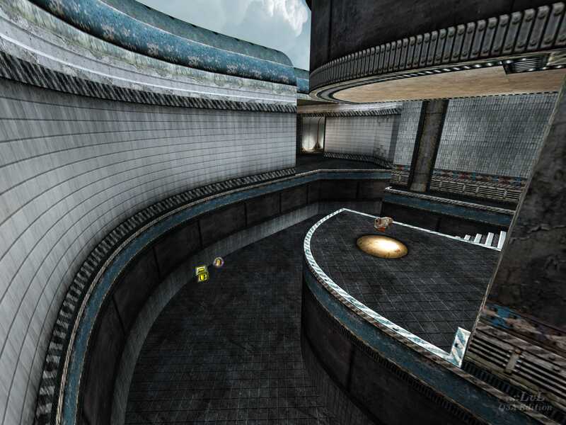
Excellent texture work and connectivity with a unique, tasteful aesthetic.
9.5!
Agree (0) or Disagree (0)
Very nice map..as usual. Layout is nice and different. It looks nice...but I was actually surprised when thinking about your last couple of maps compared to this one..it's more simple..nonetheless it's a good map. =)
Agree (0) or Disagree (0)
Very very very sexy beautifull sexy HOT map. Rota... I was always waiting for something like this. Thank you oh GOD thank you.. Be cool, be alert.
Agree (0) or Disagree (0)
It's rare I find myself taking the time to post a comment on a map these days. However, this is one of those moments. The first thing I like to do before I jump right in and play a map is have a quick run round and get a feel for the layout, etc. It may not be chock full of in your face eye candy, but there is enough subtle features to not make it unpleasent on the eye. I kind of like that. But where this map really shines is in the shear connectivity. Even in VQ3 the advanced movers (which is pretty much most of us) these days will start to appreciate just how much flow ths map really has. Examples: GL to LG (and back). LG to 25 health above stairs (and back). LG to GL to RA to RL ledge opposite SG (and back) ... SG to RL ledge (yes it can be done, it's not too high). All of this without a weapon .. on top of this if a player fails then they are still rewarded (in most cases) for their failing as the fall often drops you near a desirable item. I'd warrant at a guess if you added CPMA with pro-mode moment enabled then this map would shine even further (double jump up the stairs from the MH / RG to the LG anyone? :P). Once you start seeing the real connectivity this map has up top then the map becomes a whole different playing field. I'm looking forward to seeing what Rota comes up with next.
Agree (0) or Disagree (0)
if there is a better tourney map coming from rota than this one then i'm sure it will blow us all away. love the texture set too by the way - refreshing but still retaining a sense of realism. i'm giving it a 9, and saving the 10 for the next one.
Agree (0) or Disagree (0)
I think you made a better tourney map than some people who have already released their 2. 3. or 4. tourney map. Don't be modest. :P
Edited: 28 Apr 2009 AEST
Edited: 28 Apr 2009 AEST
Agree (0) or Disagree (0)
Ohh, thx cityy :) I am happy that you like this map, but I knew that my first tourney map will not be as good as I would like to.. But now I can do new better tourney map. :)
And classically thx for review, screens, video, .. !!
Agree (0) or Disagree (0)
You are one of the best at the moment Rota - if not the best. This map is so damn fine. I hope that you'll never stop mapping for Q3A :)
10/10 from me - originial - great for tourney - texturing is very nice - item placement is cool - strafe jumping rocks :)
Definitely a keeper!
10/10 from me - originial - great for tourney - texturing is very nice - item placement is cool - strafe jumping rocks :)
Definitely a keeper!
Agree (0) or Disagree (0)
