Added 29 Mar, 2003
Comments
Add a comment
**Preview only**
Be sure to submit your comment
Be sure to submit your comment
Submitting comment...
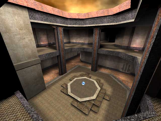
I usually have no problem with maps that look plain, simple, repetitive in texturing or boring even (I myself use that 'style' in my maps). But this map is quite large and I found myself wandering around in this map looking to get some frags and stopped to sigh. Really, I stopped, looked around and realised I did not know where to go and why. I can see the gameplay features and connectivity, it is all there. Maybe I should load up 12+ bots and try again but I don't know if it will be worth it. If the visuals were better I'd try it out but now I'll pass.
Agree (1) or Disagree (0)
Fun DM map that is larger than one might think when you start playing.
Agree (0) or Disagree (0)
Too big. Too much walking and too little shooting. I never catched the Quad without shooting the one who's carrying it. Design was ok but didn't vary much. 7/10.
Agree (0) or Disagree (0)
Yeah shame he didnt tart it up cos its a great map
Agree (0) or Disagree (0)
layout/gameplay/items are very nicely implemented. Arguably the best TDM map released in a while. Pity about the simple boring look though.
Yes I know its a cpm map and yes I know you dont give a shit about looks, but there are people who like CPMA without being completely hardcore and dont play at r_picmip 5 so that everything looks crap anwyay.
And yes it is possible to creat a good looking and good playing map, case in point nodm5 and more so hubster's recent q3jdm9a.
Agree (0) or Disagree (0)
