Be sure to submit your comment
Full comment:
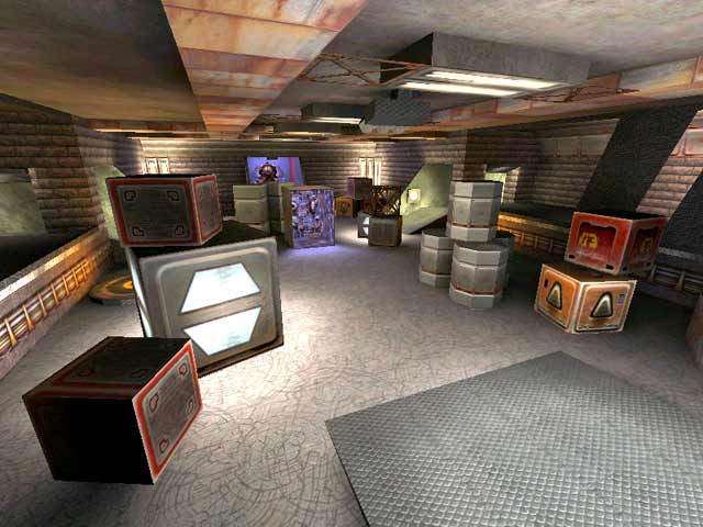
I think this map tries to be funny, innovative and trolling at the same time, but does not reach the bar. While I appreciate the attempt to resemble Quake II's design, the crates that fill the entire level seem to be too big scale-wise, as you cannot get on any of them from the floor without trick jumping. There were a lot of such crates in the original Quake 2, and you could use them as stairs or surfaces to help navigate the map. The two tunnels seem to be too long as well, and since the portals inside them just lead from one tunnel to another, they don't necessarily provide any gameplay improvement. There is however, a Battle Suite in the first case, and a gate leading to the side in the second, but I don't always want to grab the BS or not continue forward, so it doesn't really solve the issue. It would have been much better to make the tunnels shorter and add some road twists leading to different places.
Another questionable choice that the author made for this map is the BFG trap capsule. While the idea of getting a chance to pick up a BFG and an RA, but having to wait for some time as a price to pay for these very valuable items, is truly ingenious, its realization creates an impression of the capsule being rather unbalanced. 15 seconds is a lot of time to wait in an AFPS match, so I would set it to 10 or even 5 seconds instead. Sometimes, when inside, if you go at a very specific angle, you will get locked there for a second time in a row, without even having a possibility to escape first, and these are 15 more seconds to wait, albeit this time for no practical reason. It's even enough to step on the opened capsule gate and retreat — you'll be locked again in that case, too. Another point that remains unclear to me is why there's a trigger button above the BFG. Other players or bots cannot shoot it through the glass, but the trapped player can do so from inside — except for trolling the player, I don't see any purpose it serves. There's also another shootable button on the top of the construction which equally throws series of grenades throughout the entire capsule. I think that along with the fact that one has to wait for 15 seconds in order to get out, it is by far not the fairest surprise to meet them with.
A cherry on the cake in making this level's design questionable is the poster hanging on the longer wall of the capsule. What in the world is this? Is it really funny to put a picture of a man holding his finger on the trigger of a gun he aimed at a baby's head? I don't think it is. In addition, why would you put something like this in your Quake 3 map? I suppose the idea of this poster along with the BFG button is that if you get inside the capsule, you get killed because of being fooled like a baby. But then again, does it mean getting killed like a baby, because the poster is even more disgusting if so. I do realize that the idea behind it could be "getting fragged like a baby", i. e. "inexperienced player playing Quake 3", and that it's probably all meant as a joke, but at some point things just stop being funny and become inappropriate.
Speaking of what is said in the last part of the previous sentence, why is there Daemia's statue in a cage made of crossed lattice right next to this poster? It's turned away from the side where it can be seen the best from, however, but I'm still not exactly sure what to think about it. It can be considered just a type of ship cargo, especially if we keep in mind that there are various crates in the same room, and almost everywhere else on the level. However, there are no ships, water or anything else of that nature in this map.
As for some of the other things that I do appreciate about W2STORAGE, the upper floor in the capsule trap room reminds me of Quake II's first unit's second level, the map features all weapons, and the tables made with jump pads look just genius! That is where the real talent is reflected, in my opinion. The holes near the SG and GL are very useful too, as you don't have to go through the long tunnels again, which you do have to go through to get these weapons.
In conclusion, this map's design is about as controversial as it could get, and if that was the goal of the mapper (there are some upside down textures on the doors too), then it has been achieved. Was it really worth it? Not to me.
To add something more about this vertical inappropriate poster, it's located right under a horizontal lamp, and is constantly waving, which in combination makes it look like a pennant (unless you look at it from the upper floor). I'm not sure whether it was supposed to make it look racist or not, but I completely agree with @Mark (@HelterSkeleton ?) that it definitely
No violence to children. It's sad that this poster's here, in a probably otherwise playable map, as I could have given this level a chance, even despite its gameplay problems, and could've given it a vote of 3/5 and kept it on my hard drive, because the overall gameplay is here.
P. S. You can also get squished by the door of the capsule.
I think the atmosphere is nice regardless, and playing this map made me think of Babylon 5 with all the industrial/tech themed textures, but not the brick walls.
Edited 1473.2 days after the original posting.
And yes, on the note of the tasteless flag- I had forgotten about it between the time I played the map and when I reviews. It definately doesn't belong there. Is this also the map with the picture of the dead pig or whatever it is in the loading screen? Or was that something else I probably reviewed recently. Let's stick to Quake imagery please.
I'll probably eventually delete it as well- I just can't stand the fullbright areas- that's why I gave it a 6- I usually don't keep anything I give anything less than a 7 or 8. No one hardly ever plays these maps on servers anyway- and I almost never play with bots.
Free Speach goes both ways..this map stinks!
I agree with the original assessment - the gameflow is just not there. Plenty of the boxes are just a bit too close together, creating one-way-in/one-way-out situations, not great for creating cat/mouse hunt situations.
And that poster... utterly tasteless.
One odd thing was the suicide chamber (the room with the plasma gun where the door locks behind you. It should be possible to shoot the trigger from the OUTSIDE of that room, not the inside. Hence only the one in that room can activate the trap, killing himself. If the BFG were in there and the switch on the outside it would have made it more interesting (at least the BFG would lure players in there, whereas I wouldn't go in there for a plasma gun knowing I was likely to get killed for it)
