**Preview only**
Be sure to submit your comment
The bots are not so great on this map.
There are a few nice features and connectivity is good.
The mirrored floor part is (was back then) a hit on the frame rate and not vey functional.
Charon made a lot better maps after this.
Agree (0) or Disagree (0)
Feels more like an experimental map to me.
Agree (0) or Disagree (0)
Although I don't enjoy the distraction of watching my step to avoid falling into lava or a pit, after a bit of play one can become accustomed to these hazards as one must in other original Q3 maps.
This map may have a technical issue or two but I can overlook any minor issue(s) as long as there is sufficient content to pique my interest and provide for decent game play. I like the mirrored hallway and the lighting. This map is, IMHO, worth the download.
Agree (0) or Disagree (0)
Smeghead
unregistered
#26 31 Jan 2006
I remember the lay-out.. slightly... There wasn't much open space, it looked good back then.
Yep.
Agree (0) or Disagree (0)
Fraggile
unregistered
#25 29 Jan 2001
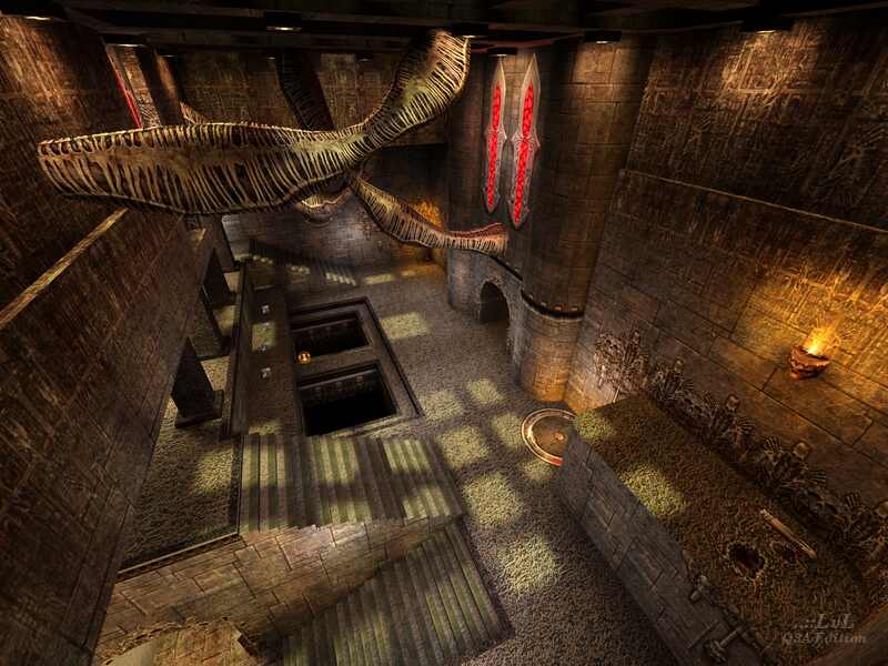
Charons first map - well his talent shines through. If you like the rest of him - start your download. Very enjoyable with 4 bots, very gothic mood and nice flow. I dont had the errors the others are reporting, maybe the map was updated.
Agree (0) or Disagree (0)
Timmy!!!
unregistered
#24 26 Dec 2000
Awesome!!! Start your downloads. I really liked the mirror floor. As for speed. People we really need to work on getting better graphix cards like what i have. (Geforce2GTS)
Agree (0) or Disagree (0)
Steinecke
unregistered
#23 18 May 2000
Those 'stair-errors' are really disturbing.
Agree (0) or Disagree (0)
Steinecke
unregistered
#22 16 May 2000
Beni iyice meraklandirdin.
Agree (0) or Disagree (0)
BBobBobbyEwing
unregistered
#21 15 May 2000
This level looks good and irregular. Its got a rough edge and isn't all that polished, the way DM levels are supposed to be. Big 8/10, congrats!
Agree (0) or Disagree (0)
Senior Teflon
unregistered
#20 19 Apr 2000
The death pits are lame; why fight the architecture when you've got enough trouble dealing with incoming rockets? The mirrored floor around the plasma gun also slows the game to a crawl, without actually adding anything to the level. Also, the entire platform area around the grenade launcher doesn't see any action at all, and it takes forever to get from that area to the rest of the map. There are some interesting ideas in this map, but it would probably play better if its elements were placed differently. And lose the pits, too. :)
Agree (0) or Disagree (0)
J@zz
unregistered
#19 28 Mar 2000
I do not know, I'll have to see it first
Agree (0) or Disagree (0)
Leviathen
unregistered
#18 24 Mar 2000
I was reaaaally enjoying this one until, when stood up on the rocket plat I looked down at the stairs and saw some viz errors. Sorry, that just kills it for me, updated version puhlease as this is too good to waste otherwise.
Agree (0) or Disagree (0)
crXy(Lewent)
unregistered
#17 31 Jan 2000
don't download
nicht gut
salaksan indirirsin!!
Agree (0) or Disagree (0)
Timothy 11 BlacK
unregistered
#16 19 Jan 2000
Amazing map...blows most of all ID's maps out of the water...just the right amount of everything...the only thing that was questionable were the 3 death squares...why??
Agree (0) or Disagree (0)
XENO
unregistered
#15 17 Jan 2000
A really good map !!!
Like the organic stuff (NICE)
Agree (0) or Disagree (0)
AndysAlien
unregistered
#14 06 Jan 2000
GREAT MAP
good for those matches where people havent played the map before... great exploring and a god feel and look
Agree (0) or Disagree (0)
AndysAlien
unregistered
#13 06 Jan 2000
BRILIANT!!!!
MAGNIFF
Im using this one at my next lan party
Charon you know how to make maps
Agree (0) or Disagree (0)
sepp
unregistered
#12 04 Jan 2000
cool map; some good ideas!
Agree (0) or Disagree (0)
Stone Cold SPider 3:16
unregistered
#11 03 Jan 2000
GREAT MAP!!!
but the "Death pits" need the red mist and a bottom same with the grated areas but overall a mad map!!!
keep up the good work!!!!!!
Agree (0) or Disagree (0)
Dr. Feelgood
unregistered
#10 03 Jan 2000
Apperance: Excellent! Well put together, variety of colors, shadows etc. but not overdone. This lvl has a lot throw in but it is put together well.
Playability: Would have been great but I don't like the death pits, maybe I'm just not that good, but didn't seem to add much but rather took away from the combat - not good. Otherwise good flow.
Bots: Need help.
Overall a good lvl that could have been great. Really looking forward to more from this mapper!
Agree (0) or Disagree (0)
strik-999
unregistered
#9 03 Jan 2000
pretty cool like the death pit room with the three levels....
Agree (0) or Disagree (0)
rapid
unregistered
#8 03 Jan 2000
Good use of textures and elements, but the level design is a bit weak and disorganized. The level forces a lot of vertical combat, which is good. Best for casual FFA.
Agree (0) or Disagree (0)
not entered
unregistered
#7 03 Jan 2000
Very nice map for the very beginning of q3a mapping
Agree (0) or Disagree (0)
Jewels
unregistered
#6 02 Jan 2000
Hey, this is a very nce lvl and the atmosphere seems just right in all areas. Except maybe for where the railgun is, it could have been a bit lighter since there is natural lighting.
Agree (0) or Disagree (0)
Cheetah(s4)
unregistered
#5 02 Jan 2000
When I saw the SS for this map it looked interesting so I downloaded it. Th file was a little hefty for my slow - @$$ connection but it proved to be well worth it. The detail used in this map is decent but where the map excedes allmost all others is in the use of the scenery. The biotic parts of the map are awsome, the level has a very gothic feel and the amount of items and health is perfect for the map. DEathmatch 1-on-1 was great and really never lost it's edge. The death pts were slightly annoying but that was really the only flaw. If you like gothic maps and you don't mind a 2 meg download I strongly recomend downloading this map.
Agree (0) or Disagree (0)
Dr Qube
unregistered
#4 02 Jan 2000
This is a pretty good map really, it has nice architechture and the gameplay is ok... Since there are only a few maps out that are of decent quality so far I have to say that this is one of the better ones at the moment. Oh and yes the deathpits should be alot deeper...
Agree (0) or Disagree (0)
ProdigyXL
unregistered
#3 02 Jan 2000
For the most part I enjoyed the map. However, this one rooms that is hung about the enjoyable pit of doom, doesn't match the rest of the map at all. He used those organic things again which looks ok, but I would of like to see them more sparling to add atmosphere. Also, no one has used the sound that is used q3dm4 for them.
Agree (0) or Disagree (0)
Tigger-oN
unregistered
#2 01 Jan 2000
Normally I use r_drawentites 0 and cg_draw2D 0 when I do a screenshot, looks like I missed a few times - sorry
Agree (0) or Disagree (0)
Plutonium.M
unregistered
#1 01 Jan 2000
I havnt downloaded this map yet and this message really isnt about that. I just have a question to the main guy at this site, I was never really able to find your name.
Anyway, why do all your screenshots use simple items? I'm sure it would alot more attractive in full 3d.
Agree (0) or Disagree (0)

