Be sure to submit your comment
Opps
Teleporter bounce pads reason: I just couldn't get then to work satifactorily without players whacking there heads on the ceiling all the time.I thought I'd try sometning different!
Slow weapon respawn? Yes - on purpose. Becomes too much of a fragfest otherwise and I wanted players to think before they shoot lest they run out of ammo.
Only one coridoor? Yep. Did that on purpose too but in hindsight I perhaps should have mirrored it.
FPS rate: It suprises me that it seems to be so low. ALL unseen faces are caulked with major use of detail brushes. Must be my bad mapping technique. I'm sorry but I cannot think of how to make it faster without changing the level of detail & the layout(ideas)?
My excuse for the map is... all faults were obviously in the original UT concept!!!
Only joking. I'm disappointed that this map does not provide more pleasure but then I'm not the world's best mapper. Anyone who fancies reworking it, contact me & I'll give you the .map file.
Ho hum... Onwards & upwards (probably).
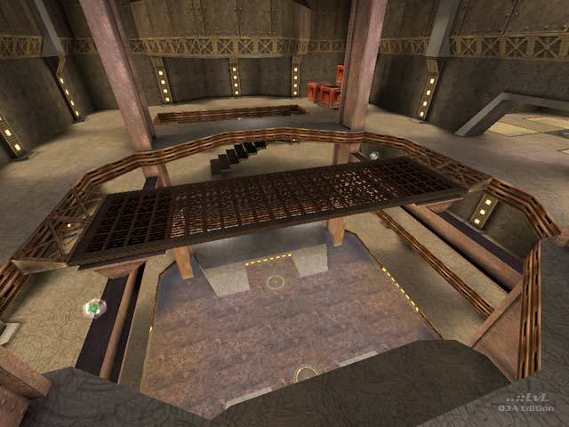
First of all, teleporter bounce pads? What? I understand that you're going up a level, but it's still plain weird. Why not just make it into a bouncepad? (Because you don't want players to be able to go back down, right? Ok, but then use a normal tele model...) Bots played pretty well but I couldn't compete due to the horrible FPS. I can't deny my machine is basically a POS, but this level has neither the looks nor the architecture to account for the slow down.
Weapons seem to respawn slowly, with the exception of the plasmagun. Combine this with the fairly sparse layout of said weaponry (except for the PG and RG, right next to eachother) and too often you'll find yourself running right out of ammo. The level could do with some MG ammo boxes.
Flow was stinted towards one side of the otherwise symmetrical (ignoring items) layout because of an entire hallway only present on one half of the second floor. It just seemed funny to upset the balance this way - why ever use the other half? Powerups made for a bit of fun with a classic high up centre placement.
Has potential, but general layout and item placement choices are not up to par. Combined with the unaccountably low FPS, there's not many reasons to download this...6 from me. Though I am interested in future efforts from Europa, I've enjoyed some of his past work much more.
-Octovus
