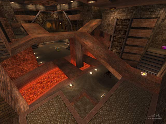
Emptiness comes to mind more fiercely than misery does when playing this level. The level is of a Gothic theme with a few of the metallic base textures thrown in. The map is comprised of one large, central, multi-level chamber with a number of smaller, outlying rooms and passageways. The reason emptiness came to mind was because although the level appears to be pretty large (say, large enough to support six players) while playing, only the lowest two levels seem to offer real fragging opportunity. Climbing towards the upper areas takes time and offers little reward. Bots as well stick to the lower levels and tend to hang out on one side of the map. As far as brushwork goes, everything is very angular and very clean. No curves here.
If you've got some buds who still play Q3A, Misery is probably worth a few rounds of play.
Reviewed by Radix
Second opinion
Wow .. first impression was a bit ewww :/ It was basic editing but the skill was a bit hidden. The map brings back the fun of good old Quake 2 games. Some very good matches can be had on this map. Almost no camping and spawnfragging happens less then usual. Weapons are balanced and ammo is well placed. The MegaHealth is a little tricky. It's more of a trap then a health pack :D Many trick jumps are provided by the structure. The map reminds me of Doom II level16 DM games.
The only negative point is the 16 unit stairs. They look nice because of very lovely texture but if you spot a person climbing 16 unit stairs its shuttering your view .. 8 units are ok for stairs (and also id Software's suggestion for stairs in Q3A) but that's a minor negative point for me.
A perfect map, great example of mapping skill! For me a total keeper.
Reviewed by Dayta
Ranked: 3.6 out of 5 (5 votes)
Download: Misery by Kaz
