Added 20 Feb, 2001
Comments
Add a comment
**Preview only**
Be sure to submit your comment
Be sure to submit your comment
Submitting comment...
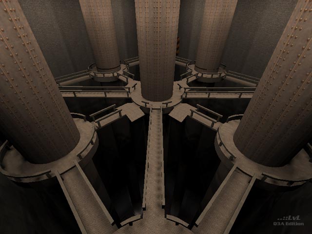
Reminds me of Duel Of The Fates but mixed with boring, grungy textures. It needs more color to make it look more appealing. 4.5/10
Agree (0) or Disagree (0)
The area in the screenshot looks like a cross between an Ewok Village, and Duel of the Fates. Sadly, it's one of the more interesting parts of the map and bots almost never go there. I didn't quite understand the point behind the jumppad-like ledges on the side of the railings.
The lack of an .arena file and poor bot routing hurts this map. It should have been worked on more.
2.5/5
Edited 1115.44 days after the original posting.
Agree (0) or Disagree (0)
Oh, c'mon, it beats the tusks, eh? No?
Agree (0) or Disagree (0)
Judging by the screenshot alone, it looks interesting. If you can multi-level the room and broaden the walkways a bit, this can make for a quite interesting mid for a CTF or CTF:TA game.
Maybe a good idea to make something of it, add some rooms and a flagroom on each side, stylize em a bit, and follow twhat I said here and I think you can have a very enjoyable map....
Agree (0) or Disagree (0)
Well, it was our 1st map and as it says in the readme we went a bit... all out to cram in all our ideas. Fair comments though.
I hope we've improved a tad with our future maps!
Agree (1) or Disagree (0)
Looks like a certain room from a certain Phantom Menace final fight scene.
But Paul is right if the scale of the photos keeps those walkways as narrow as they look. Scale in Q3 seems to be continuosly under-played. Error on the side of 'too big' and scale down from there. The proportions in Q3 are just so different from Q2.
Agree (0) or Disagree (0)
wow what a harsh review. i downloaded the map thinking it would be great and i can finally have a reason to flame tigger...sadly however it turns out tigger was right. what a p-u of a map =/ , gl next time.
Agree (0) or Disagree (0)
The room in the screenshot has some very strong gameplay possibilities, but the scale isn't in keeping with the movement and playstyle of the game. Quadrupling (at least) the horizontal scale of this room and building several supporting chambers in a complementary style could form the core of an exciting map for vQ3A, CTF, Q3:TA or one of the many mods. The rest of the map would have best been left as "sketches", undistributed until they had recieved some thematic unification and polish.
Agree (2) or Disagree (0)
