Added 09 Oct, 2000
Comments
Add a comment
**Preview only**
Be sure to submit your comment
Be sure to submit your comment
Submitting comment...
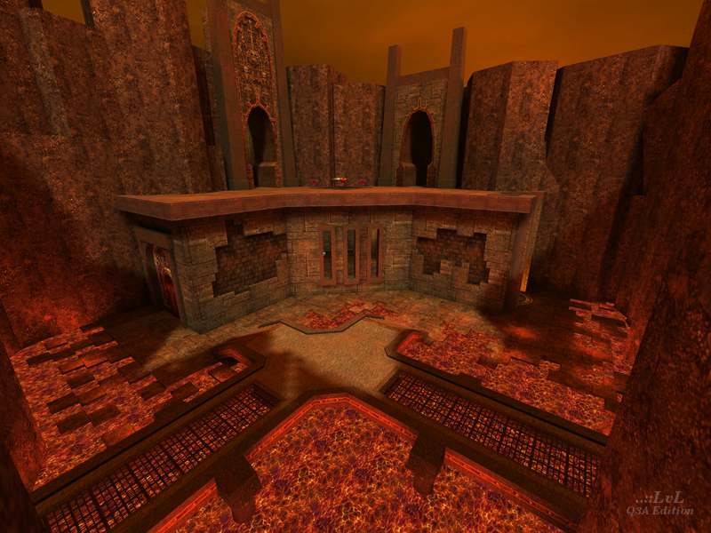
Ok map. I like it. A bit too much horizontal orientated. Hallways a bit too long. Still good atmosphere.
Agree (0) or Disagree (0)
Uhm, the map plays quite well, but did you ever hear of the caulk shader??? The curves you applied cause z-buffer conflicts "en masse".
Nice work, though.
Agree (0) or Disagree (0)
this map is not bad at all it feels a bit different to same gothic maps for some reason, maybe its just me,but its got some kind of an atmisfear that i like , im not very good at spelling, maybe i should of finished school lol anyway i dont mind this map at all look forward to your next map eFDAT keep up the good work mate.......happy fraggen WarMachiine....hehe :)
Agree (0) or Disagree (0)
not a bad map ,cool teamDM play.
Reminds me of some of the levels in Q2 single play.
could be all the lava ?#$%%$#
Agree (0) or Disagree (0)
Item placement sucks....rocket launcher, fall down to RA, walk to quad, 0wn the level =(
Rocket jumps are good on this level for movement tho....
I had some good fun on this lvl tho, but really, spread out the ammo a bit more...two slugpaks at the rail was the proverbial drop imo....
Agree (1) or Disagree (0)
It item placement seems pretty fuzzy to me. A bunch of ammo clips are placed near the respective weapon (which discourages roaming. There are a lot of visual details, but there is nothing that especially stands out. The layout has pretty good connectivity, but it takes some extra work to get to the high ground.
Spam is only fun for a while.
Agree (0) or Disagree (0)
