Be sure to submit your comment
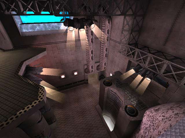
Again, some really nice ideas though. The tube where you could peer through at the fish was a great one. But then...it's not really executed well. The fish aren't that cool, and the rock surfaces are really dull and uninspired.
Also the missing texture is bad. It's a glaring reminder of sloppy work whenever you turn that corner.
I'm being hard because I think this could've been great with more work. I really liked Sundown's comment that credit is due for trying something different and not failing miserably. But this one kinda feels like it's still in beta. 6.
Ok Red, enough fussing over textures!
This is one of those really different maps that I really like. I found nothing wrong with the water tube, in fact I even stopped in the middle of it to watch the angel fishes go by! I also like the fact that the map looks a lot bigger than it really is. What Tig said about ideas and features is unfortunately right, but I'll keep an eye on Kit's future work for sure.
The fish are neat as well.
I wasn't convinced I was in a submarine , like the name of the level implies, more like an underwater base .
Even though it's not the best new map out there, if you like underwater stuff - get it .
I enjoy it !
8.5/10
