Be sure to submit your comment
Edited 52 seconds after the original posting.
(Steinecke actually rating a map as wonderful?? Hell it's gotta be good, i'm off ta get core as well!)
They 'diving' framerates can be stopped by investing in a GeForce- card.
By the way,Mr Tigger: I need five more ip-numbers (for Steinecke, Lord Stephen Stonecorner, undeaDDisney, Quadaffi, Shirley 'Headshot' Quadmuffin). They promised me, never -NEVER! to place useless crap on a comments-page!
you will find two links on the maps page...
-Powzer
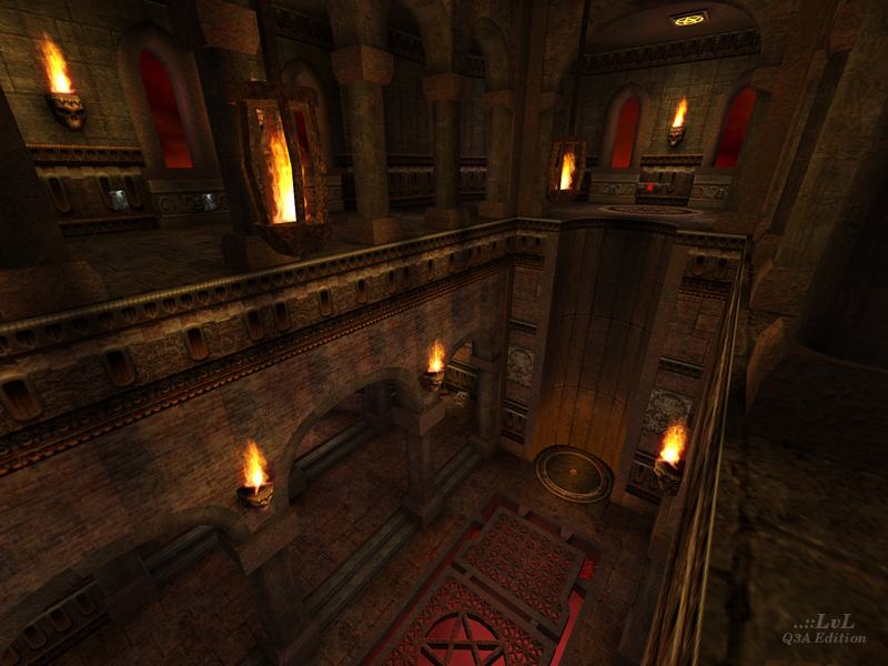
First of all, this is a great-looking map in many ways, especially the architectural flourishes like the view in the outside court. I'm not going to address its looks anymore -- they're just fine, and you've got lots of other people telling you the same thing there.
But after playing this map a couple of times, I really don't have the urge to go back to it. Why is that? Well, three things.
- The map is completely symmetrical. I'm sure you've heard the saying that a symmetrical map is half as interesting. That's overstating the case to make the point, but there is a kernel of truth there. A symmetrical duel/FFA/TDM map can be good, but you're giving away a lot of chances to create more interesting spots by going that route. Personally I'd say to leave symmetrical maps to CTF... if you have the urge to "commit symmetry", do it in restricted locales, but not over the whole map. This isn't a major strike against your map, but it did noticeably lower its "interestingness" for me.
- There's a lack of truly interesting combat areas. The outer court is basically flat. Between the court and the main atrium there are some halls, which aren't that inspiring as fighting locales. The main atrium has some good things going for it... particularly, fighting among the columns down on the main floor. But combat on the ring of the upper floor isn't that exciting, and fighting between the floors is hampered by the distance and the upper columns. So there are some cool/fun combat locales in the map, but not an abundance.
- Maybe most importantly, the overall layout of the map is linear. You do have some circular connectivity on the "micro scale", in individual locales, but a good DM map needs it on the macro scale (with at least one crosscut) for more interesting and varied gameflow.
Them's my opinions anyway. I'd say if you took most or all of the powerups and holdables out of jk_tourney1, it would be a more fun map than this one (performance issues aside).
It's definitely a well-built map, from a technical and aesthetic standpoint, and it's good to see you executing a different style than in your previous outing. Keep it up.
The rl room looked to me like it would be a focus of the map, what with Megahealth. However, the bots (with the exception of Anarki) disagreed. I think this is good, as it is a one way in and out room, I don't tend to like those. However in this case it made sense, that was the only place I found rockets (no ammo elsewhere if I'm not mistaken) which means you have to get rockets from there.
The rg was classic, facing the ra which itself was placed on a treacherous ledge. Grabbing the RA, armor shards, and then the +5 healths with a rocketjump (or a strafe, if you can do them right wishes he could) seemed a good technique.
The gl next to a 25 health and the sg next to a 50 initially struck me as a what? but considering the little health around the map, it was well placed. In this map with lots of ledges, the gl is much better than sg (hence less health next to it)
The organic wall insets, complete with skulls, ambient sounds, and even a skeleton of in one corner, made the basement the coolest (if not most useful) part of this map.
One more thing: Tourney is fine, but FFA works real well here, it's plenty big.
Grab this gem now, 9 outa ten because of rl room and one bug therein (I think it's a bug) You can rocketjump to the ledge above the megahealth..if that's not a bug, I think it should be taken out anyways.
Anywho, tx for the great map PowZeR!
Happy Fraggin! Octovus
