Added 18 Apr, 2013
Comments
Add a comment
**Preview only**
Be sure to submit your comment
Be sure to submit your comment
Submitting comment...
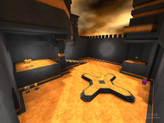
map looks slick and tidy, and the accessibility to the rg, gl, lg, mh are all really witty. just such a shame that the layout isn't there to back them up. but one can really see your DeFRaG brain at work here.
Agree (1) or Disagree (1)
It could be possible to fix this with a new botfile. Lemme see if that's the case... EDIT: It seems like it's that way.
Edited 6.73 minutes after the original posting.
Edited 6.73 minutes after the original posting.
Agree (2) or Disagree (0)
Rust7: No problem, bro. Awesome work here, for sure! :D
Vymmiatacz: The whole bot issue is mentioned by Tig at the end of my review, but as for the answer to this, I'm not entirely sure. It could be the orange floor texture that's screwing things up like Tig says, but I'm not that convinced that that is the issue. Still, it is irritating. :/
Vymmiatacz: The whole bot issue is mentioned by Tig at the end of my review, but as for the answer to this, I'm not entirely sure. It could be the orange floor texture that's screwing things up like Tig says, but I'm not that convinced that that is the issue. Still, it is irritating. :/
Agree (2) or Disagree (1)
Very unusual style.
Bots aren't working for me. On such construction like this (not very big and complex map), they should play flawlessly. Something is really screwed up here.
Bots aren't working for me. On such construction like this (not very big and complex map), they should play flawlessly. Something is really screwed up here.
Agree (0) or Disagree (1)
