**Preview only**
Be sure to submit your comment
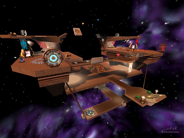
I agree with much of what muffinator says in his original comment, except perhaps for the lowness of the score. Yes, ctf can be something of a stalemate (so near and yet so far), and without coverage, overload too. Harvester and 1 ctf work the best, but I would have liked to see the lower platform a little larger, or to have one or both entities moved to the rg platform to encourage more use of the map. The RG could have been placed down below (a trip and risk to get to) plus the coverage provided by the platform above, and the instant teleportation back to bases from portals at the remote platform significantly reduce the possibility of sniping. Kamikaze, as is convention, would have worked better here than the invulnerability, because its timely use can always prevent a capture/harvest/etc. at a critical moment or displace players guarding a flag/skull. visible seams on the skybox was also not that visually appealing.
Edited 4.67 minutes after the original posting.
Agree (1) or Disagree (0)
Thank you for more than thousand downloads in total :)
Agree (1) or Disagree (0)
New level released some weeks ago: Opposing Teams (czq3p61ctf1 - zip file right to download in the map queue here on ..::LVL. Waits to the review...
Agree (0) or Disagree (0)
I'll release new map from base of map by PaN61 (he gave me permission to port his map to Team Arena, when I've found the map style to be usable in this great modification) soon as possible.
I have some troubles which slows down my time to mapping (one of these troubles is school).
Agree (0) or Disagree (0)
Impressive map :).
Agree (0) or Disagree (0)
Also, this box set looks heaps better than the plain original black box set!
Agree (0) or Disagree (0)
To me, everything about this map was awesome, the textures, the portals and the bot play. The only let down would have been the flags too close together. Maybe if one flag was up where the quad damage was, and the other flag right away from it, maybe make another platform somewhere opposite to it, then the map would be a perfect remake in my eyes. 7.5/10
Agree (0) or Disagree (0)
In addition: I'm making new style of my web. It will be done at least in two months, I think (I don't have much good time thinking)...
Agree (0) or Disagree (0)
I have some troubles with doors in map, it doesn't teleport spectators throught doors and don't know, how to do it...
// It's solved now. Radiant compiles map with very useful bug: autodoors and teleporting spectators throught these doors.
Edited: 08 Nov 2011 AEST
Agree (0) or Disagree (0)
Emigration map's almost done. Only go to tests.
Edited: 05 Nov 2011 AEST
Agree (0) or Disagree (0)
You're right, Emerald. Textures used in map make feel of that combination. Layout is from my head, so there is similarity only in textures.
That looks nice CZghost!
//Edit: Thank you. I think, that this map will have more fans...
Edited: 02 Nov 2011 AESTAgree (0) or Disagree (0)
That looks nice CZghost! Reminds me of a combination of mpteam3 and team8. (A good thing, btw) Definitely looking forward to it! :)
Edited: 31 Oct 2011 AEST
Agree (2) or Disagree (0)
czg3team2, Emigration is almost done. It only waits for small edits such as make jumppads functional and make doors triggerable.
In #9 are actual screenshots
Agree (0) or Disagree (0)
My forum created:
czghost.ic.cz/forum/If the forum doesn't appear, wait for new web design, that forum hosts.
Edited: 27 Oct 2011 AEST
Agree (0) or Disagree (0)
Agree (0) or Disagree (0)
@TheMuffinMan: I'm making next map from first set (czg3team2). It's named Emigration and layout is my own.
Agree (0) or Disagree (0)
@FistMarine: I don't agree with many of your votes either. You do vote regularly as I can see in the votes list but oddly enough I rarely see the corrosponding map download in the downloads list. That makes me wonder whether you actually try the maps before you unjustly vote for them (and often very low ratings foir maps that play very well might I add). I don't rate maps according to how the screenshots look, how the review sounds, what other comments are like or let my voting change because someone else's rating didn't agree with my opinion.
What I can add to my previous comment is that this map would have taken 2 hours at the absolute maximum to make, especially considering the original is open source. Such little effort and fundamentally poor gameplay does not, imo, make even 5/10 justifiable. 6.5/10 is way too high. There are maps out there that are original, have better gameplay and took a lot longer to make than this which actually do justify 6.5... nevermind your 9.5.
@CZghost: I'm sure you can do a much better map, and even this map could have been better. I suppose some people will find some enjoyment from this but I still don't agree with releasing it in this state. Then again, there are worse maps on this site!
Edited: 23 Oct 2011 AEST
Agree (1) or Disagree (0)
I agree with you, muffin. This map is only testing opens to TA mapping in fact, so I don't wait for good rank of release. I wish, that other maps, I will do, will have better ranking.
Agree (0) or Disagree (0)
I'm not sure how many times dm17 has been remade, reduxed and regurgitated. I was interested in the idea of having flags spawn on both sides of dm17 in Quake Live (with the flags near the RL spawns) but only for the lawls.
This really has little going for it and 3 second captures is really what it boils down to in ordinary CTF. You'd have to be bat-shit crazy to go to the bottom platform for the invulnerability - not only does it give your opponents more chance to score but also actually using that item could allow your opponents to score 3 times over, especially if you don't have an RG! The teleporters serve practically no function besides speeding up the gameplay some (which is a good thing here) but it just feels 'slapped in' and cheap - use some creativity when making changes!
To fix the inherent issues, this map should either be played in instagib or players should spawn with an RG with 3 or so slugs, and replace the RG spawn with a couple of slug ammo packs. Maybe replace the NG's with LG's too. The rule of thumb in a CTF map is: the faster you can capture the flag, the more defensive fire-power the map needs to be packing. As EmeraldTiger pointed out, those accel pads connecting the top platforms truly ruins the gameplay when you also have the flags on the top platforms - the flag bases would be better suited to the RL platforms. The raised flag bases make the boundaries behind them steppable (I'm not sure if that was the intent in making it like that) - that could be a good thing since it raises the risk of getting the flag a little more since one mis-step means you fall into the void.
Including the Guard rune here is practically the same as giving players god mode. There's very little chance in preventing someone with 200-100 and regenerating health from capturing.
Shooting the obelisks in overload is easy with the lack of any protective boundary for the obelisk. 1 flag CTF and harvester are the only gametypes this map works alright with.
A mapping experiment, not a release map imo.
3/10
Agree (3) or Disagree (0)
This is my first TA map, but I've done any other for BaseQ3 before TA release. These aren't released here.
But thanks to review, I'm pretty sure, that other more will be from my head ;-)
Agree (3) or Disagree (0)

