**Preview only**
Be sure to submit your comment
Love the map, I like such detailed design.
Agree (2) or Disagree (0)
A very old & dark look to the map. Love it. still need to test it though.
Agree (1) or Disagree (0)
DwInt
unregistered
#17 30 Jul 2011
Great map, but it's way too easy to complete. Anyway, nice atmosphere!
Agree (1) or Disagree (0)
Pretty cool map. I like the design and texturing. It's obvious how much work was put into this. My only complain would be that... there are no sp monsters :/. It's such shame Q3 didn't have normal sp mode. Anyway, it's worth checking out, so grab it now!
Edit: Actually there is one small issue in my opinion - read me file :). There's nowhere told that there are actually 2 ways to finish the map, and that player should run it via 'skirmish' menu (at first I've run it like always via console, and there was no bot). I think Read me should be fixed, so player will see and experience all that is possible to.
Edited: 22 Dec 2010 AEST
Agree (0) or Disagree (0)
Doh....brain not working....lol
Agree (0) or Disagree (0)
SW12
unregistered
#14 21 Dec 2010
I probably would have Submitted if I had GTK Radiant working. Also my only question for the map was; I forgot how to get into the window to the plasma rifle. How do you do it? I remember doing it my first time playing it.
Agree (0) or Disagree (0)
Guys, there were no other maps, it's right there at the top of LvL's homepage,
"The winner of the first every ..::LvL Comp is D-Meat with a fantastic entry called Lo sota Olt. Sadly however, this was also the only entry":(
Edited: 21 Dec 2010 AEST
Agree (0) or Disagree (0)
That would be nice to see the other contestants maps.
Agree (1) or Disagree (0)
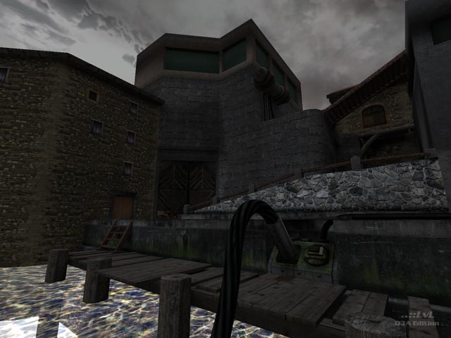
On-topic though, the screens look incredible but I haven't tried the map yet. That massive file size is putting me off (damn you bandwidth cap :( )! But like I stated it does look great, I'll give my opinion on it when I have the chance to try it. By the way, where's the other contestants' maps for this competition? It'd be great to see them all, even second and third place awards.
Agree (0) or Disagree (0)
@SW12 (and lol): Here are two samples so you can see for yourself:
Taken at 640x480, with no re-sizing -
lvlworld.com/level...e-no-resize.jpgTaken at 1600x1200, then resized to 640x480 -
lvlworld.com/level...with-resize.jpgNo screenshots were ever taken at 640x480, there has always been some resizing (smallest would have have been 1024x768), however the large the original the better the final 640x480 shot.
NOTE: The originals for the panorama are taken at 640x480, however each panorama is made from 120 screenshots and only the middle 20 pixels are used, but I'm thinking about a different method for these :]
Agree (0) or Disagree (0)
SW12
unregistered
#9 18 Dec 2010
So what is the difference from The way Screenies looked before and after that update?
Agree (0) or Disagree (0)

Tig Rep. 2352
#8 18 Dec 2010
@lol: If you mean for every map on the ..::LvL, then no. If you mean for all maps in the latest update, then yes.
I pretty sure all maps added this year had the original screenshots taken at 1600x1200 then re-size the 640x480 - the results IMHO look best processed this way.
Agree (0) or Disagree (0)
lol
unregistered
#7 18 Dec 2010
Tig, Did you capture screenshots in all levels with resolution 1600x1200?
Agree (0) or Disagree (0)
Very nice atmosphere with good textures and geometry ( the caves look realistic).
I didn't have any fps problems....good work....:)
Agree (1) or Disagree (0)
$$
unregistered
#5 15 Dec 2010
I beat it but now I forgot how to get into the Plasma Gun secret in the closed window
Agree (0) or Disagree (0)
SW12
unregistered
#4 15 Dec 2010
I remember first time playing this, I was in the first area of the level, and I shuddered at the thought of That creepy Guardian bot jumping out from nowhere in the haunted halls in which I got lost in.
Agree (0) or Disagree (0)
Yes, one of the best maps i've ever seen, though the size is a bit big, but it's worth the wait.
Agree (0) or Disagree (0)
Beautiful map! The level of detail is overwhelming; I felt so inmersed into the environment, that all the time I was cautiously looking around like if some monster was going to jump on me from around a corner. Those old shields scattered around the place helped a lot to feel that way.
I loved the two ways to make to the end, too. Although the first time I played the map, I loaded it through the console, so I made it to the end and left and thought, "where's that damn Guardian bot?" until I realised I needed to load the map via the Skirmish menu.
I didn't go around hunting for bugs like Morbus did :P but I did find some weird visual effect through a hole on the ceiling inside a room where there's a switch to activate. And on a few spots, the fps drop really bad, like from 60/80 to 15, at least on my 7 years-old computer with a Geforce 4.
The only other draw-back for me was the doors sound at the beginning and the end, those two parts with a short suspense music would have been great.
This is a great release, D-Meat. I guess with some more time for beta testing and work on the concept, it would have been awesome (and it will be if you plan to work some more on it and release an "improved version"). Thank you very much for your hard work.
Edited: 15 Dec 2010 AEST
Agree (0) or Disagree (0)
SW12
unregistered
#1 15 Dec 2010
This is by far the best SP map Ive ever played. Only problem is when I died on the outside area from having so much health taken away from the Guardians. So with 1 Health I fell on something so I had to respawn. I respawned in a black room, then the computer froze.
Helpful tips-DON'T DIE
Agree (0) or Disagree (0)

