Added 10 Sep, 2006
Comments
Add a comment
**Preview only**
Be sure to submit your comment
Be sure to submit your comment
Submitting comment...
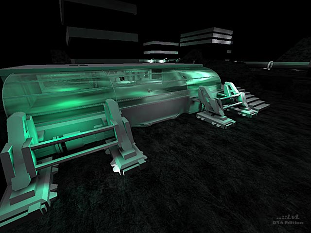
The lighting is way too low. I had to raise my gamma up to the max in order to see the ground. If the map was not so dark, I would have given it a higher score than a 3.5
I feel like this map could have been a tad more elaborate, but I think that as it is it is very good.
Agree (1) or Disagree (0)
Too low lighting... Pratically i see nothin...
Agree (1) or Disagree (0)
This map holds some nice ideas.
But they are not so well finished...
I like the tube but it doesn't add/fit in the gameplay, instead of speeding up the game, it slows it down. The different parts of the map aren't all that well connected, while playing i got the feeling that this map has a lot of dead-ends.....
I think the map was a bit on the dark side but I enjoyed the green atmosphere...
As I see it there has gone quite some work into this map but beta testing could improve the map quite a lot. Just look at the screenshot, nice architecture around the pipe! I can't shake off the impression that the author gave up on this maps layout, in terms of gameplay speaking.
That's a bit of a shame.
I can understand a mapper decides/wants to release this piece of work cause it holds quite some effort but it could have been a lot better. (sometimes less is more)
Guess, I kinda agree with the review.
Edited: 25.Sep.2006 20:42 AEST
Agree (2) or Disagree (0)
