**Preview only**
Be sure to submit your comment
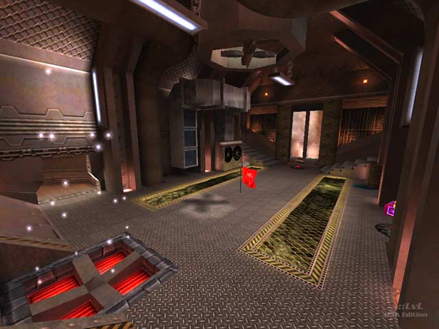
Can't quite get the excitement that others seem to get, based on comments and votes. I find layout confusing, too narrow to move around, let alone strafe. It's missing a big nice room for middle fight. Quad is in a tiny room. Some decorations are cool but the core of the map is too coarse imo.
Edited 13.07 hours after the original posting.
Agree (1) or Disagree (0)
note: harvester and overload are not supported which is a shame.
Agree (0) or Disagree (0)
This map kind of reminds me of a UT2004 map I played but I forgot what it's called. I've played many TA maps and I got to say, it's a good map. I loved the way you set your map out and Gameplay is just absolute mad :). 8.5/10.
Agree (0) or Disagree (0)
WonderSlug
unregistered
#5 28 May 2003
Excellent map. I just watch 6v6 CTF with custom bots I made and they navigate it well.
BTW, MopAn, Doom3 will be single-player only. Quake 4, based on the Doom3 engine, will have all the Team goodness.
Agree (0) or Disagree (0)
*papri-K*
unregistered
#4 27 May 2003
very nice work from the point of view of the architecture, texuring and atmosphere. The gameplay has the annoying problem of having to hitting your head against the roof when you jump in many passages, which also are very narrow and you can get stuck easily when fighting.
gg
Agree (0) or Disagree (0)
Scarlet
unregistered
#3 26 May 2003
Another great map MopAn. Had to vote a 9. Look forward to future maps, with great anticipation.
Agree (0) or Disagree (0)
mIKE
unregistered
#2 25 May 2003
ups no more comments for this wonderful map, shame on you.
So here is one from me, give a 8 and great work mopan.
keep on mapping
Agree (0) or Disagree (0)
MopAn
unregistered
#1 19 May 2003
Hi everyone,
thanx DGhost for all your work and write down such a nice review. Tried my best to get best atmosphere for underline the imagination of a settlement on mars combined with q3-technology. I'm not really satisfied because the grafics seems to be too much 'comic-like' in the end. I also tried to create an 'easy to learn layout' which was a little problem with 'Polaris' the predecessor-map of mine. Don't know what future technologies will make it possible to do. As I read theses days there will be no team-play with doom3 which is bad I think. I also won't have much time these days because of personal plans to join IT-industry. We will see, there should be always a little time to set some brushes here and there... ;) greetz to all of you who love to 'create' and especially 'play in' virtual worlds. Thanx
Agree (0) or Disagree (0)

