Be sure to submit your comment
The item placements are really good like the megahealth placed in the center of the map as well as the items being in various locations around the map. Really good Tourney map but if you decide to play it in Free For All (FFA), you should play it with 4 or 5 opponents becuase if you have too many opponents, the map would get really crowded.
Gameplay is good but the Quake 3 bots (If you are playing against bots) hang around the lift (1st floor) but they sometimes push the button to get onto the 2nd floor but once they are on the 2nd floor they just stand around the lift (2nd floor) or jump down to the 1st floor and repeat the whole process again which is stated in the readme by Lunaran. Bots do explore the whole level instead of just hanging around the same location.
Really nice map Lunaran, 8.5/10.
PaN61
Edited: 02 Oct 2010 AEST
also continue working for CPM Lunaran.
Good news: The gameplay aspect of Lunaran's maps has been improving.
From a normal Quake 3 standpoint, the MH/RA proximity is very appropriate, and using the default MH respawn time (as opposed to 75s anyway) is very critical to establishing quality gaming. Switching the RA and YA with a YA and GA for CPM is a very nice touch, as I have sensed frustration with GAs obviously not appearing in normal Quake 3, and with the dominance of the CPM RA. The item load is very good, although 4 shell clips is excessive even for normal Quake 3, and the two shotguns feel a little close to each other.
The connectivity is pretty good, but the map almost feels manufactured (and 90° angles really do feel sharp) and a little tight. The texturing looks like ass with /r_picmip 5 (much moreso than with other maps).
I was wondering if anyone would have ever made a Pro Mode map with a Plasma Gun but no Railgun for a DM 1vs1.
In terms of normal Quake 3 DM 1vs1, this one ranks somewhere in the top 20. Thank you, Lunaran.
I don´t know what are the bots searching in the elevator...
Lunaran i prefier lun3dm2, this one is not so good, a quite small for me. =)
Rating->7 (almost 6 =P)
Por cierto auhsan, pa cuando tu proximo mapa, estoy impaciente?
-8-
This one : www.planetquake.co...un3dm3-b0rk.jpg
Anyway, the map. Plays great, flows great, looks great (sure its a little repetitive but when it looks as good as this who cares? )
if everyone made maps as good as this then that would be very good... Um. yes
"and what overlapping brush?"
Face the teleporter closest to the red armor, and turn 180 degrees. Walk straight until you're just inside the corridor. It's at face level on the left side right next to the column with the stripes.
Also watching them swim to the RL is good. Lunaran, I'll help you kill anyone who mails you about the bots, they serve a good purpose: comic relief.
That said, the map plays...ok...it looks....ok...and yet, it is somehow cohesive. You'd think with classic dead-end-with-a-teleporter rooms (such as the one featured here, complete with grenade launcher) would either be great or awful.
I see Nimrod's point. But somehow, this map adds up to more than the sum of it's parts. Small "innovations" (they aren't really new, just not used very much) such as the slime around the rocket launcher add something. The doom lift button sure brought back memories, though I would have loved to have to hit a key to make it work :-D
The rl was a bit easy to defend if you grabbed one first, and it was tempting on occasion to zip back and forth through the tele near the YA and the one it lead too. RA place I think..not too sure...
Anywho, good job, sure as hell 1,000,000 times better than I can do :-p
-Octovus
P.S. Gave it a 9. No, you can't ask me why. I don't know :-p
good work Lunaran
Well, q2dm1 is a rather good and fun map, not my cup of tea, and i find it overrated, that map has the same prob that dm4, it was THE map in its game. So everyone and his dog played this.
More, lun3dm3 has a pretty good layout, well interconnected, vertical action and some funny places for battling (the RA-LG room).
More, although auh3dm1 has a good playability, it hasnt a good gameflow (all the action happens at the same places)
I dont like q2dm8, just square rooms and more square rooms that are "multileveled". The only good thing about the map is all the tricks you're allowed to do (and that was a luck matter).
More, is strange to see how much ppl has done maps as detailed as lun3dm3, with the same amount of architecture and details, with that good taste, and being as innovative and creative as this.
You talk about gameplay? Obviously you're stuck in the old id's maps, although those maps play great, there are tons of more maps, and every map has something special (well, not the crappy ones). This map has something special in its looks and its layout, great grenade traps in the central room, great strategic situations ala dm4 and great game pace. Yeah, im in love with this, and is by far the best lun's map, ans one of the best ever (this layout can even compite with ztn3dm1's one).
Coriolis Storm has no ffa nor Duel modes, it just plays well in TDM, LDBAST has not a great tourney (teleporters ruined that) and this definitely rocks. Yeah, keep it up, man
Such Maps
Q2DM1, Q2DM8
AUH3DM1(Incidentally Auhsan your map does this extremely well)
I just feel noone recognizes the distinction between maps that use asinine hallway -> room connection methods, with maps that use far more innovative layouts.
and what overlapping brush?
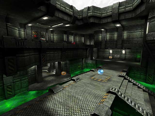
the overall ambience is great and the gameplay shines. It must not have "dominating architectural pieces" but the brushwork is excelent and the lighting is superb...
CPM version 0wns m3 t00, it is a shame that I don't have a d0g tho =).
The map is reasonably fun, however I feel that is more a symptom of the map being small then a result of the map being laid out with sheer brilliance.
The architecture is nothing extraodinary, nor is the lighting. The textures are fairly nice. Everything is built and textured so similarly though. Since there are no dominating architectural pieces, everything blends into this mish mosh of indistinguishable greys and greens. It's unfortunate.
Aside from my complaints, this is definately an above average map. Everyone should d/l it. I just felt Cyberhazard's review was a bit off, so I did my own.
