Added 29 Nov, 2000
Comments
Add a comment
**Preview only**
Be sure to submit your comment
Be sure to submit your comment
Submitting comment...
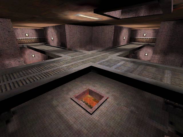
The lighting is too simple.
The layout for each floor lacks some vertical gameplay also on each level there is not much room to move. So gameplay is a bit slow.
The layout for each floor lacks some vertical gameplay also on each level there is not much room to move. So gameplay is a bit slow.
Agree (1) or Disagree (0)
This map leans too close to the Dark Side.
Agree (0) or Disagree (0)
Thanks for your input and remember great minds think alike!
Agree (0) or Disagree (0)
The map plays ok, textures and ligthing are ok , but after a while it gets a bit boring. The weapons arent located very good and all the teleporters seem to end up at the same spot. For your first map you didnt do that bad. Hope your next map will be a better one. (rating : 6-)
Agree (0) or Disagree (0)
Was amazed your/my nick came up again on planetquake/lvl, only this time it wasnt me. Haven't played the map yet, still downloading it, my ISP is a b1tch. I'll give you my opininion and vote as soon as it's downloaded.
Agree (0) or Disagree (0)
