Added 31 Jan, 2000
Comments
Add a comment
**Preview only**
Be sure to submit your comment
Be sure to submit your comment
Submitting comment...
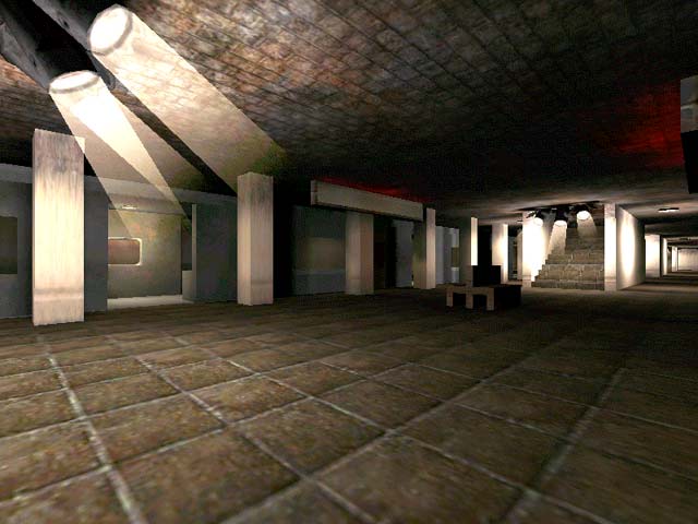
I have played many train station maps for Q3 and I have to say they are better than this one. Sorry to dissapoint you with this but its true. Just do a little tewaking with the textures and your all good to go :).
Agree (0) or Disagree (0)
Would have been better if the trains moved. A very decent map for its time that could have been better.
2.5
Edited 1436.47 days after the original posting.
Agree (0) or Disagree (0)
Again, nice idea, but (frame rate/textures aside), there are other problems such as the trains being too narrow and difficult to get in/out. Bit samey and too long and thing.
Perhaps if there were moving trains (or some kind) and multiple platforms across (rather than one long one), it might be a bit more enduring.
Agree (0) or Disagree (0)
Well.. not much to say. Is this a first release? (At least for quake3). If so keep at it, great idea, but the textures were really bland. Also, the red lights upstairs got a little annoying.. and taking out the gl and replacing it with the lg would work well IMO.
Happy fraggin! Octovus
Agree (0) or Disagree (0)
This map was a cool concept...but beginners look and boring....oh the shading was real good though
Agree (0) or Disagree (0)
Nice idea, but just too much symmetrical.
and the gameflow is not that good.
better luck next-time
Agree (0) or Disagree (0)
Ouch, this review is a bit late. I realized the graphics did slow down because of the textures and have made a few more levels. I had sent this level in about a month ago but because of this sites server kicks it took a while for the review to catch up. Thanks for the comments and check out my site for newer levels www.geocities.com/...are/bunker/1404
Agree (0) or Disagree (0)
Interesting map but I had to use vertex lighting and turn almost everything else off to get decent framerates on my poor little Voodoo3. Also I really don't care for symmetrical maps. I think it could have been better if it was more like a REAL train station.
Agree (0) or Disagree (0)
