
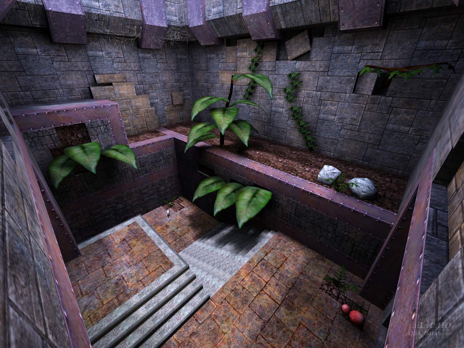
It's simple with sparse weapons and items, but has easy interconnection. There's nothing revolutionary happening, just things that are simple and done well. A classic.
Edited 31 seconds after the original posting.


If you haven't tried it yet, then you MUST try it now.
:)
W.

It's now six and I'm still not bored :p
I remember play testing the beta and seeing the addition of the shotgun happen. A great map with excellent flow.
This map is really a keeper. Give it 9 outa 10.
Very good job Nat...
9/10 - (only because there wasn't a fuly outdoor bit)
:) ps-importantant thing i guess is that you are not a devil worshiper! hehehe
Drew J: think of it as a Star shaped grate then? =). I actually thought about this for a second when I placed the grate. I thought to myself, "man, people are going to think I'm some kind of satan worshiper" as I proceded to place the grate anyway. Didn't think anybody would complain.
I watched some demo's of the pro's playing on DM13 and realized that I hadn't been using the grenade launcher enough.. Untill I saw that demo I was still reaching for the default grenade key or scrolling through my weapons to get the grenade. now that baby is bound to a closer key. Anywho, I love being able to predict where a bot is going and watch him run over the grenades (splat!!). Pill spamming is fun =).
weasel: You can't be serious, My textures are good and id textures are boring?? Thanks for the compliment, my head is swollen now and I'm thinking about a carreer change =) (texture artist!).. it's probably just the lighting on the id textures that you don't like. I think a lot of people would prefer that I throw in some torches to add some warm light and contrast.. Maybe I'll consider doing that on my next level (if I ever get around to it). Personaly I like this look. it's got it's own sorta mood and is easier on the eye's.
Octovious: Yes these are pretty damn big leaves and the fact that they grow out of stumps and dirt is kinda odd too =).. Guess I should lay off the crack =P.
Johny Law: I was afraid of that.. I only played the map once with another person before releasing it. and we ended up on the other side of the map half the time. I think he was too busy checkin out the cracks in the wall to play. It just requires a different style of play (I hope).
gorilla: The art could have definatly gone a long ways.. I just don't have the time for it. Hopefully other mappers will realise the potential in custom textures/map objects and create true masterpieces.
This map would have perfect with some sort of aztec/celtic/egyptian ancient symbols or runes....why copy id?
The bots hover around the ML, even playing with 2-3 bots. Turns into a grenade-a-thon!
Outstanding map otherwise, and highly recommended!
There are minor issues with item placement: the weapons look mostly if they've just been plonked down in corridors rather than having special spots for them, and the loadout is a little low for FFAs. Also, as pointed out by some below, the map could have been a bit less flat.
I'll give it 9, but it's pushing 10.
The cob webs showed very good attention to detail and climbing the tree is cool, maybe there should be a mega health or something up there.
The models were excellent. I'd give it an 8.5
Great models and fun gameplay.
10/10
Those vines and all could do a really cool overgrown Aztech temple themed level, I think. It already kinda looks that way a bit.
Gameplay, although flat, is pretty good, with lots of cutoffs and escapes once you learn the map. I like for a fun 1v1. I'll have to try this one against real people somewhere.
i'm not really a fan of the colors and atmosphere, but this is very personnal. still....a very nice and original piece of work.
there are playability issues (albeit small, picky-uny ones) with this map, but overall, it's a HELL of a lot better than most.
9
Good ambiance, too
;)
sorry, need more practice.
It's not bad, but the review by lvl would make you think it's a masterpiece. The connectivity is the strongest point here. This offers a solid, fast FFA game. But the art could go a long way. The leaves and such are real "boxy" looking, and there's no variety anwhere on the walls. 90% of the map is made of the same two colors.
So many maps either look great or play great but not both. I think that's the case here. If you have a shortage of small fast maps, this isn't a bad on to have, but I feel like a little more work could've taken this one a long way.
I just got it though so I'm not voting yet. Wouldn't be fair.
This map is a visual treat. Not just the plants, but the brushwork and texturing. Good detail, everything blends together nicely, some cool architecture out of the field of play, all sorts of good points there. Probably worth a download for that alone.
It doesn't play bad, but something bugs me about the gameflow. In 1-on-1 it seems the players are not drawn together as often as I would like. (There's barely enough "stuff" for a FFA... 3 players manages OK.)
The lack of RG and inclusion of PG is a nice and refreshing change! It works in this map very well. I also loved the plants, though the lack of clip brushes on leaves which, given their size would support your characters real weight is kinda weird =). I understand it might screw connectivity up, but then don't put the plants where they could become stairs.
I didn't play tourney, which is obviously this map's focus now that I've tried it out, but FFA was pretty fun too. A little strange looking though..it's as if your in someone's overgrown castle courtyard or something. Also the bizzarely large plants (with the exception of the tree) but normal sized building, i.e. the rooms aren't scaled to make you seem small is rather strange.
The gameplay was good, though the RL area, with the SG, GL, and RL and SG ammo was a little campable. Plus the RA wasn't that far away.
Like I said, not what I was expecting, but nonetheless and 8 outa 10 ;)
Cyas! Octovus{QsRu}
Loading...
Search for a map.
Results will appear here.
