Added 15 Jul, 2000
Comments
Add a comment
**Preview only**
Be sure to submit your comment
Be sure to submit your comment
Submitting comment...
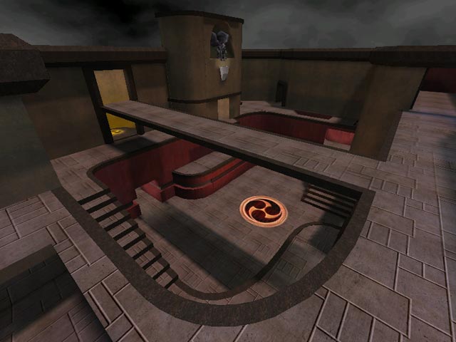
This level has incredible flow. Transitions from the corridors to the courtyard area are seamless. Very fast gameplay with 2, 3, or 4 players. To sum up, this map is the Shiznit!
Agree (0) or Disagree (0)
Not much on the eyes, but it played pretty OK for the Weeze-meister.
Agree (1) or Disagree (0)
Cool map.....i like running it with speedquake mod....sneaky way to get to Quad. Like it !!!
Agree (0) or Disagree (0)
Well you are right it is a map that I did for Q2. I dont ever remember releasing it to the public. MMMMMmmmmmmmmm......maybe it was when I was hammered....
Man I wish people would email the authors of maps when they like there work. Even just a simple email to say hey I played it it was decent.
Oh well I am glad someone sees my work.
Does anyone know if Betadm2 ever got any reviews?.... if so where can I look at them.
Oplulent where did you pick up beta2dm?.....
Goose
Agree (0) or Disagree (0)
Does anyone here know that this is a re-do(with some good additions) of one of the best Q2DM maps - BEta2dm? He hints at this in the txt, but doesn't come out and say it. I think it rocks against the bots in both Tourney and ffa. For Q3, it is a little on the ugly side(compared to it's competition). My complaints: it is NOT a real Tourney map(ie. humans) and it has parts that you just avoid(like the original). What is ICQ anyway? hehe
Agree (0) or Disagree (0)
develop the areas out side the main room, a few more details"alot more actually, totally rework the entity placement, this could be a 6 or 8
Agree (0) or Disagree (0)
You know, this would work pretty well as an arena map.
Agree (0) or Disagree (0)
This seems to come down to just a lot of railing in a big open space. The fact that the armors, the RL, the Quad, the MH, and for all practical purposes the RG are all in this space.. doesn't help the gameflow. :-)
So: IMO the side rooms need to be developed more, and the item placement needs to be seriously re-thought.
Agree (0) or Disagree (0)
I've removed a few post which where nothing more than a conversation between two people who didn't seem to know about ICQ.... (incase you where wondering where they went)
Agree (0) or Disagree (0)
While I appreciate the author's intention of aiming for high fps rates, this is just all rather ugly.
Agree (0) or Disagree (0)
Reminds me a lot of the edge so it deserves an 8 :).
Agree (0) or Disagree (0)
