Be sure to submit your comment
too much clutter.
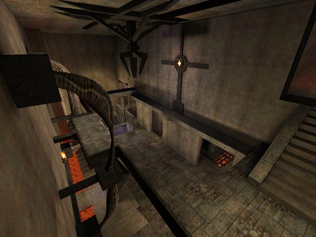
The problem with this map is that a lot of it looks too much like a bunch of brushes put together in Q3Radiant and not like a credible building. Texturing is fine, it's the architecture that's the problem.
Good map- much better than the usual bland industrial stuff. It actually has some ambience!
{For a good UT map (yes, I play that too) go to UT Underground, and download DM-NetherWorld
And nicely done the detailing is too, what there is of it. But overall the map leaves the impression of being a touch underdeveloped. The large bare areas of concrete probably magnify this impression. An occasional coloured banner or other symbology might have lifted this map. Perhaps pilasters and a greater use of wall features generally would have camouflaged problems of lighting artefacts, and patterns that emerge as 'random' patterns in textures repeat. A spartan aesthetic at the expense of visual problems is not ideal. A bit more light, as so often, would also have been welcome.
However, it is clear that much thought has gone into the layout of this map: as you move about it picking up weapons and other items you're constantly aware of the designer's mind at work.
All in all, very enjoyable. And, with all that concrete, so much more like a techno map than the gothic it actually is.
I really don't know, how long it takes, 'til this map is available there. Another source for maps is: 3ddownloads.
Fileplanet is functioning sometimes, if you wait for a rather long time for the downloads start.
Lets drink lava and shoot pipes. There is no 7.5 -I'm giving '8'.
(A very organic map with pipes is 'Evil1'; it's too dark with too small corridors for most users, I guess.)
