Be sure to submit your comment
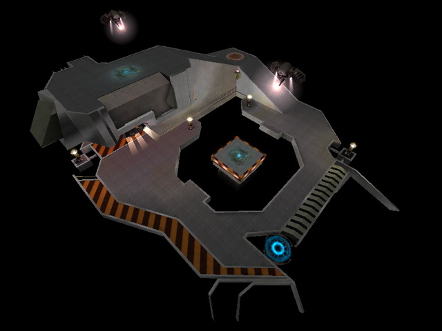
It's very small, and there is absolutely nothing protecting you from going over the edge.
But!
Your opponent, perched above, cannot hold the high ground indefinitely. And when they've been vanquished, it's your turn to rule from above. For as long as you can, that is.
Our first time playing this map 1v1 the score ended 8-6. Sounds rather ordinary, right? 8-6 after 35 suicides by the winner and 31 suicides by the loser. (so 43-37 in kills) Damage totals were 13k apiece (which I believe is a record for us), and the round took 30 minutes. But we had a LOT of laughs and neither person was completely out of it.
There's a lot of fun to be had here. You just have to 'stop worrying and love the ...suicide'.
the design is sweet
kinda small, but damn COOL
O...M...G
that is what I call a FUCKING GREAT MAP =))) Very small, very thight very...INTENSE!! just enough space to hide, to dodge and to go back to frag
incredible in 1o1 and up to 3 not more :p
Looks great play incredible. :)
download now closed eyes! :)
Great job Dooball more maps planned? =p
the shiny tin shaders didn't show up on that screenshot...
check out www.dooball.net/le...dootourney.html for more download links and info and www.dooball.net/maplogo.jpg better screenshot

