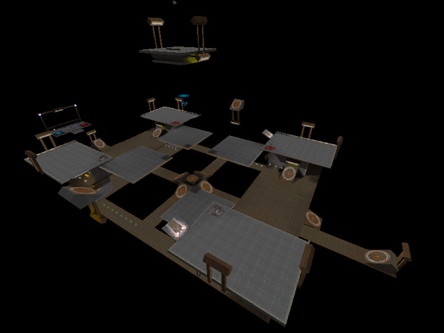
Added 02 May, 2000
Comments
Add a comment
**Preview only**
Be sure to submit your comment
Be sure to submit your comment
Submitting comment...
I don't mind the BFG & rail here: both weapons are meant to offset each other and the moving platforms are supposed, in part, to ruin los but lost yard bp set up really doesn't work with respect to the "original" parts of the design, because coupled with the moving platforms trap players down one end of the map with no quick escape routes leaving you exposed to attack esp at the rg end. the moving platforms are way too fast driving players either down into the void or up into the platforms squashing them from above. the hastes are more an enemy than a friend. meant to help you avoid bfg/rail but more likely to send you into the void. they are like racing stripes on cars; cool but they really don't make you go any faster. gl: pointless here. it does have its uses, but not really the only weapon you want to have when you spawn. completely useless against long range attacks from the further platforms. the alcoves with the items at each corner again are also problematic especially at the rail gun end of the map, leaving players again, both trapped and exposed. meant to protect you from the bfg??? but you have to go the long and open way around just to get to them; so again, not much help! All this amounts to gameplay pushed largely onto narrow ledges at the pg end of the map with no really good los to stop players going for the BFG and a lack of pads/teleports traversing the upper lateral routes to help cut players off on the pass. This leaves rather slow and precarious routes down to the bottom and back up again via bp and platforms. this all feels way too ill-conceived for what is essentially a direct overlay onto the dm17 format. For these reasons I wanted to give it a zero score, because clearly nothing really counts as an improvement here, but it did at least cover the basics; only just. the levelshot was more interesting for me than the map itself. I only wish the author had spent as much time on the design as he did coming up with the clever title. A real shocker!
Edited 14.07 minutes after the original posting.
Edited 14.07 minutes after the original posting.
Agree (2) or Disagree (0)
i thought it was fun seeing bots flying and railing them.
Agree (0) or Disagree (0)
Damn.. if only there where not so many complex brushes used for the pads, this level would have been so much better. Think SIMPLE...like square plattforms or something like that...
Agree (0) or Disagree (0)
If you like camping and you like space maps, and you dont care anything about how a map looks....download now!!!
I found this map bland. Its hard to get to where you want without rocket jumping.
The frame rates are high and i like the platforms hover speeds, i will give it this much. I liked the longest yard and the bouncy map is my favorate q3 map period. So i do like some space maps....just not this one. 5/10
Agree (0) or Disagree (0)
For a map with this item selection, it was put together well. Still, the BFG is just a little easy to get.
A campin' we will go, a campin' we will go... (5)
Agree (0) or Disagree (0)
I guess I am a space map fan because I enjoyed playing it. I love how fast you can move around the arena and the moving platforms make it more dynamic and fun. The bots were fun but against real people I can already see the quad/bfg whores ruining a great space dm so it lost a lot of points from me...
Agree (0) or Disagree (0)
