Be sure to submit your comment
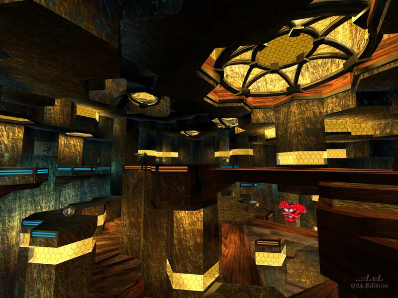
There are other architectural elements in AF3HEX that make me think the author may have been inspired by Classic Doom when creating the level, such as fast lifts, curved stairs and platforms. While it is true that none of these features are atypical for Quake 3 either, I would say this map does have some feel of a certain single-player level, as I often feel like I'm progressing on this map as I navigate it. If I think about it, there's a need to circle strafe on The Singing Void due to its slaughter nature, while The Stolatene Mine provides some opportunities for circular movement due to the curved staircases, so since this is an arena map, this similarity may be another factor for more associations of these two levels with each other for me :)
The color palette is well chosen and allows to maintain both the contrast (which I think is one of the key factors that make this map so brilliant) and the harmony thanks to the shades of brown and yellow. The lighting is magnificent and makes the map distinctive and memorable.
The gameplay is almost top-notch, too! A lot of verticality, curved stairs and platforms, faster movement grâce aux jump pads and speedy elevators. I just wish the level was larger in size, beacuse even considering the movement in this room is very original and fun (despite the fact it's only one room), the map can feel somewhat cramped in times.
In sum, this is a very fun map for some rotatory rounds, so next time you spin around this map, be sure to turn the wheel of circling games :P
